Home
Web
Branding
Product
About

CW
Branding
Case study
EclipseCorp
Rebrand for a full-stack creative production agency
Objectives
- Modernize the color palette
- Maintain the original typeface
- Increase legibility of the logomark (EC) at reduced sizes, especially for social media
- Unify the separate business services under one parent company and brand
- Create a simple design system that keeps the brand in the backseat to the imagery
One vendor saves on cost and time
- Fewer price markups 15-35% of the total budget saved
- Lower coordination costs: One kickoff call, one production schedule, smoother file handoffs
- Fewer production errors: Correct image resolution, proper crop areas, color matching
$47K
Separate vendors
$38K
$9K saved
One vendor
Before the rebrand, many clients only used one or two EclipseCorp services per project. Clients may have discovered that EclipseCorp could photograph, retouch, print, and install their project only if they were already through the sales funnel, and if the EclipseCorp project manager identified an opportunity to offer multiple services in-house.
Challenges with the original logo
The original logo struggled in aligning with other nearby elements due to the upside-down T-shape. The mark didn’t scale well for social media either.
Aligning the tops of elements creates visual imbalance.

Aligning the bottoms works if the element height matches the logo text height. The icon can also feel disconnected.


A square holding shape inside of a circle creates tight space near the corners, and removing the square altogether makes the logo feel like something is missing.
New logo iterations
We explored many iterations as a team and revised the logo a dozen times, testing color schemes, typefaces, and including elements of older logos. Ultimately, we agreed with leadership to maintain the recognizable EC monogram and house it inside a circle to better pair with the roundness of the wordmark and generally reference the “eclipse” element of the name.
Filming and editing by Jared Miller
The rulebook
After the logo was designed, the brand guide was created to control the application. A brand guide is an essential source of truth enabling different designers to execute the brand in a consistent way.
Business statement
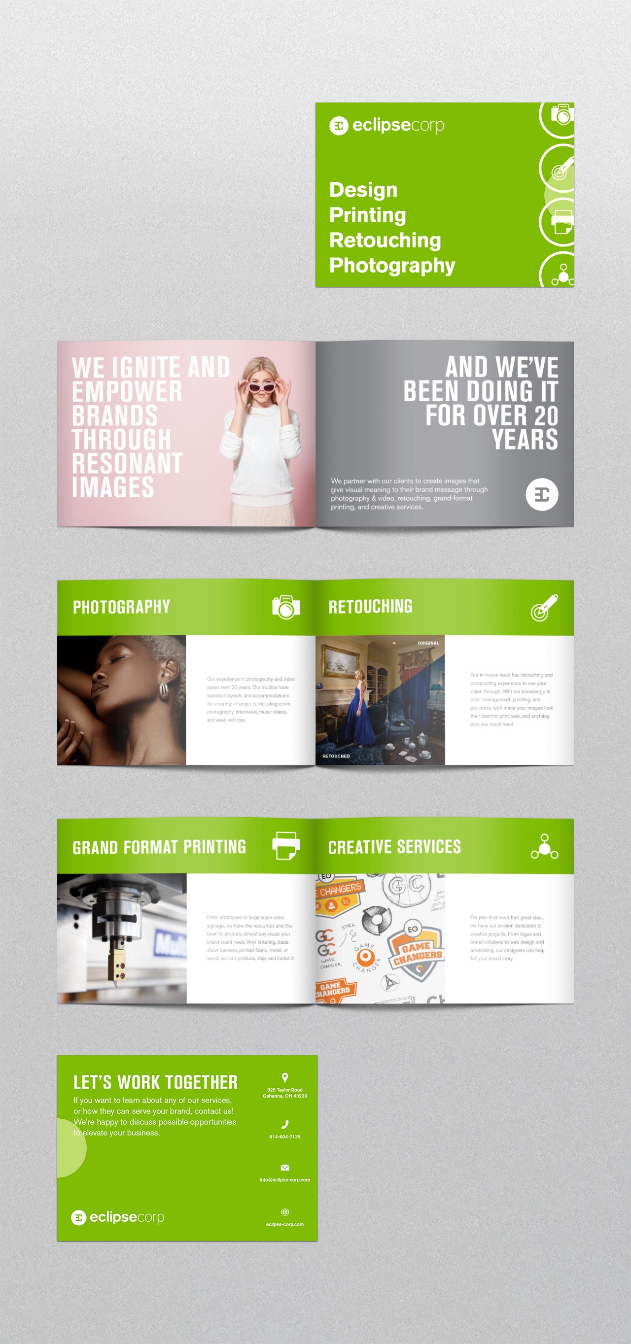
EclipseCorp is a multidisciplinary business with four main focuses:

Photography & video

Printing & installation

Retouching

Creative services
The company got its start in 1994 with a focus in photography, and in time, printing, installing, retouching, and graphic design became service offerings to support photo projects, helping make EclipseCorp a one-stop shop.
Tagline
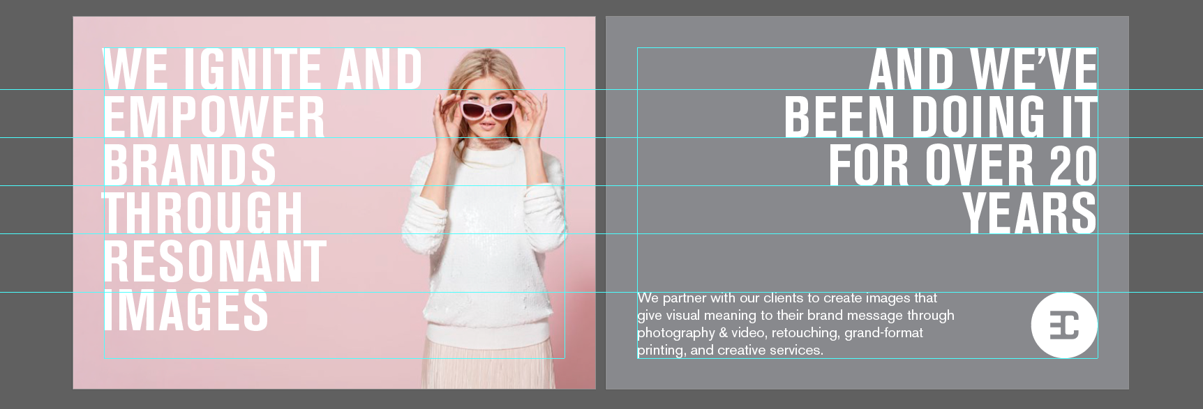
Igniting and empowering brands through resonant images
Color
The EclipseCorp brand is clean, light, and airy, and designed to take a backseat when paired with the imagery they produce.
Why green?
Green is associated with calm, growth, renewal, and money. Lighter greens tend to feel fresher and more approachable while darker greens feel more traditional or stable.
A medium gray is versatile in use and wouldn’t distract from imagery.
Primary
#84BD00
RGB 132, 189, 0
CMYK 54, 0, 100, 0
Pantone 376 C
Secondary
#888B8D
R 138 G 139 B 141
C 54 M 0 Y 100 K 0
Pure black ink: K = 55
Pantone 8 C
Backgrounds
#FFFFFF
R 255 G 255 B 255
C 54 M 0 Y 100 K 0

Overlapping colors is not recommended to maintain legibility and color contrast.
Typography
Akzidenz Grotesk is a classic typeface that has been in use for over 100 years. The condensed font creates visual contrast making it useful for headers while still feeling like part of the family.


Mailer
Rather than leaving it up to chance or putting the responsibility on the project manager, proactive communication around all of the services EclipseCorp offered was a better marketing strategy.
Not AI generated
Business Cards


This project was a collaboration with designers Tyler Dunbar and Jamie Linscott while we worked for EclipseCorp.

Colin Wendt
Home
Web
Branding
Product
About
Branding
Case study
EclipseCorp
Rebrand for a full-stack creative production agency
Objectives
- Modernize the color palette
- Maintain the original typeface
- Increase legibility of the logomark (EC) at reduced sizes, especially for social media
- Unify the separate business services under one parent company and brand
- Create a simple design system that keeps the brand in the backseat to the imagery
One vendor saves on cost and time
- Fewer price markups 15-35% of the total budget saved
- Lower coordination costs: One kickoff call, one production schedule, smoother file handoffs
- Fewer production errors: Correct image resolution, proper crop areas, color matching
$47K
Separate vendors
$38K
$9K saved
One vendor
Before the rebrand, many clients only used one or two EclipseCorp services per project. Clients may have discovered that EclipseCorp could photograph, retouch, print, and install their project only if they were already through the sales funnel, and if the EclipseCorp project manager identified an opportunity to offer multiple services in-house.
Challenges with the original logo
The original logo struggled in aligning with other nearby elements due to the upside-down T-shape. The mark didn’t scale well for social media either.
Aligning the tops of elements creates visual imbalance.

Aligning the bottoms works if the element height matches the logo text height. The icon can also feel disconnected.


A square holding shape inside of a circle creates tight space near the corners, and removing the square altogether makes the logo feel like something is missing.
New logo iterations
We explored many iterations as a team and revised the logo a dozen times, testing color schemes, typefaces, and including elements of older logos. Ultimately, we agreed with leadership to maintain the recognizable EC monogram and house it inside a circle to better pair with the roundness of the wordmark and generally reference the “eclipse” element of the name.
Filming and editing by Jared Miller
The rulebook
After the logo was designed, the brand guide was created to control the application. A brand guide is an essential source of truth enabling different designers to execute the brand in a consistent way.
Business statement
EclipseCorp is a multidisciplinary business with four main focuses:

Photography & video

Printing & installation

Retouching

Creative services
The company got its start in 1994 with a focus in photography, and in time, printing, installing, retouching, and graphic design became service offerings to support photo projects, helping make EclipseCorp a one-stop shop.
Tagline
Igniting and empowering brands through resonant images
Color
The EclipseCorp brand is clean, light, and airy, and designed to take a backseat when paired with the imagery they produce.
Why green?
Green is associated with calm, growth, renewal, and money. Lighter greens tend to feel fresher and more approachable while darker greens feel more traditional or stable.
A medium gray is versatile in use and wouldn’t distract from imagery.
Primary
#84BD00
RGB 132, 189, 0
CMYK 54, 0, 100, 0
Pantone 376 C
Secondary
#888B8D
R 138 G 139 B 141
C 54 M 0 Y 100 K 0
Pure black ink: K = 55
Pantone 8 C
Backgrounds
#FFFFFF
R 255 G 255 B 255
C 54 M 0 Y 100 K 0
Overlapping colors is not recommended to maintain legibility and color contrast.

Typography
Akzidenz Grotesk is a classic typeface that has been in use for over 100 years. The condensed font creates visual contrast making it useful for headers while still feeling like part of the family.


Mailer
Rather than leaving it up to chance or putting the responsibility on the project manager, proactive communication around all of the services EclipseCorp offered was a better marketing strategy.
Not AI generated
Business Cards
This project was a collaboration with designers Tyler Dunbar and Jamie Linscott while we worked for EclipseCorp.
Colin Wendt
Home
Web
Branding
Product
About
Branding
Case study
EclipseCorp
Rebrand for a full-stack creative production agency
Objectives
- Modernize the color palette
- Maintain the original typeface
- Increase legibility of the logomark (EC) at reduced sizes, especially for social media
- Unify the separate business services under one parent company and brand
- Create a simple design system that keeps the brand in the backseat to the imagery
One vendor saves on cost and time
- Fewer price markups: 15-35% of the total budget saved
- Lower coordination costs: One kickoff call, one production schedule, smoother file handoffs
- Reduced production errors: Correct image resolution, proper crop areas, color matching
$47K
Separate vendors
$38K
$9K saved
One vendor
Before the rebrand, many clients only used one or two EclipseCorp services per project. Clients may have discovered that EclipseCorp could photograph, retouch, print, and install their project only if they were already through the sales funnel, and if the EclipseCorp project manager identified an opportunity to offer multiple services in-house.
Challenges with the original logo
The original logo struggled in aligning with other nearby elements due to the upside-down T-shape. The mark didn’t scale well for social media either.
Aligning the tops of elements creates visual imbalance.

Aligning the bottoms works if the element height matches the logo text height. The icon can also feel disconnected.


A square holding shape inside of a circle creates tight space near the corners, and removing the square altogether makes the logo feel like something is missing.
New logo iterations
We explored many iterations as a team and revised the logo a dozen times, testing color schemes, typefaces, and including elements of older logos. Ultimately, we agreed with leadership to maintain the recognizable EC monogram and house it inside a circle to better pair with the roundness of the wordmark and generally reference the “eclipse” element of the name.
Filming and editing by Jared Miller
The rulebook
After the logo was designed, the brand guide was created to control the application. A brand guide is an essential source of truth enabling different designers to execute the brand in a consistent way.
Business statement
EclipseCorp is a multidisciplinary business with four main focuses:

Photography & video

Printing & installation

Retouching

Creative services
The company got its start in 1994 with a focus in photography, and in time, printing, installing, retouching, and graphic design became service offerings to support photo projects, helping make EclipseCorp a one-stop shop.
Tagline
Igniting and empowering brands through resonant images
Color
The EclipseCorp brand is clean, light, and airy, and designed to take a backseat when paired with the imagery they produce.
Why green?
Green is associated with calm, growth, renewal, and money. Lighter greens tend to feel fresher and more approachable while darker greens feel more traditional or stable.
A medium gray is versatile in use and wouldn’t distract from imagery.
Primary
#84BD00
RGB 132, 189, 0
CMYK 54, 0, 100, 0
Pantone 376 C
Secondary
#888B8D
R 138 G 139 B 141
C 54 M 0 Y 100 K 0
Pure black ink: K = 55
Pantone 8 C
Backgrounds
#FFFFFF
R 255 G 255 B 255
C 54 M 0 Y 100 K 0
Overlapping colors is not recommended to maintain legibility and color contrast.

Typography
Akzidenz Grotesk is a classic typeface that has been in use for over 100 years. The condensed font creates visual contrast making it useful for headers while still feeling like part of the family.


Mailer
Proactive communication is always a better marketing strategy than leaving it up to chance or putting the responsibility on the project manager
Not AI generated
Business Cards
This project was a collaboration with designers Tyler Dunbar and Jamie Linscott while we worked at EclipseCorp.