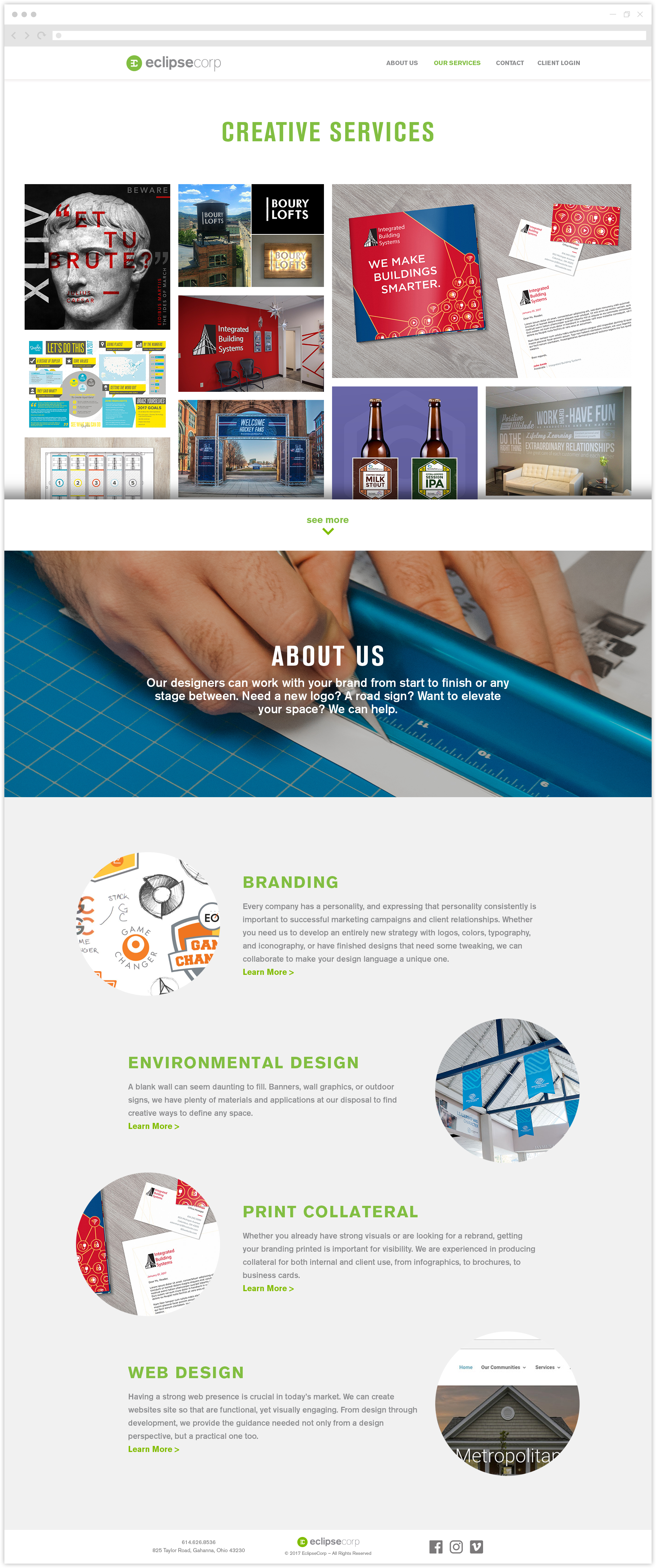
Inspiration for displaying projects on the new EclipseCorp website came from independent artist portfolios because EclipseCorp wanted to showcase work in dynamic ways. Having interactive images with vertical dividers showing the before and after made most the most sense to demonstrate the work of retouching. A modular grid of images varying in size was more functional than a slideshow, and more engaging than a rigid grid of squares.


