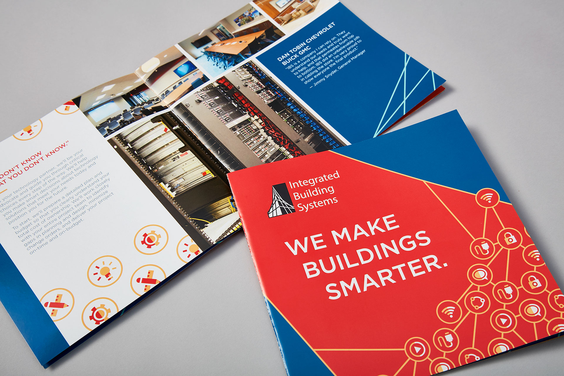
Integrated Building Systems wanted to update the look of their office to coincide with their brand refresh. All of the following images are photographs I captured during the tour of their office, then later mocked-up with graphics in Photoshop to realistically contextualize design concepts.
Maximizing the Budget
Walls were digitally recolored to demonstrate how painting could easily and inexpensively transform spaces. A dimensional PVC logo is used as an impactful centerpiece upon entering the lobby.
Digital Manipulation
Clear acrylic picture frames around the TV were digitally removed. The vinyl webbing design in this context was inspired by its use as an accent design in their print collateral.
Context Sells Concepts & Ensures Accuracy
These renders were easily understood and approved by the client, and additionally provided the printers and installers at EclipseCorp with reference material to accurately translate designs from digital to physical.
Areas for Opportunities
The client wanted to display their portfolio of IT installation images around the office. This corner served as a good viewing space for canvases.
Elevating Presentation Provides Legitimacy
Larger visuals and high-quality materials give Integrated Building Systems a more professional and legitimate feeling when touring the office.
Cohesive Execution
This icon for Cabling used in their print collateral was appropriately repurposed for the demo room, where employees learn how to properly install and arrange IT equipment for clients.
Combing Materials Creates Visual Interest
The use of canvas and vinyl illustrates how different materials can work together to create engaging designs.

