
Packaging
Case study
Granola Bar Pakaging
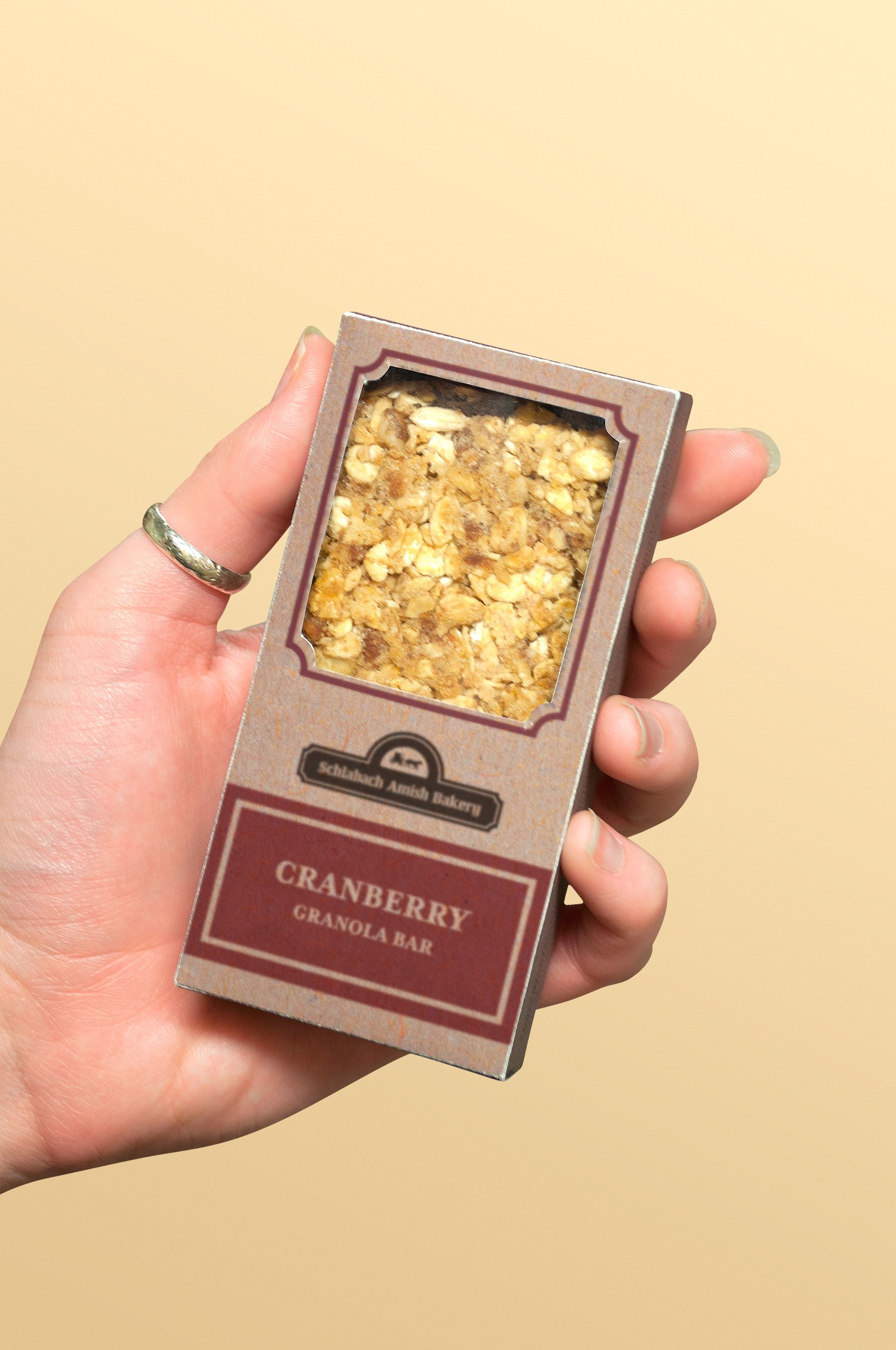
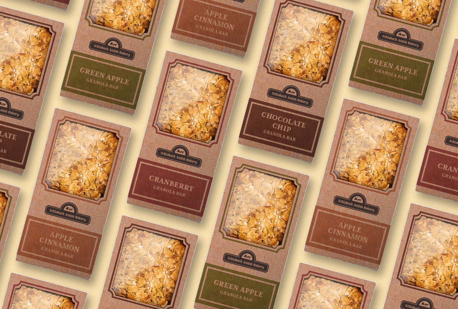
This granola bar packaging had 3 main criteria: visual uniqueness, desirability, and sustainability.
Objectives
Visual uniqueness
The package should stand out better than its competition at point-of-purchase.
Desirability
The package must improve desirability and recognition over the existing package design.
Environmental
The artwork should utilize 1-2 inks with sparing use of adhesives, relying more on mechanical closures.
Research
"Made by People - Not Machines"
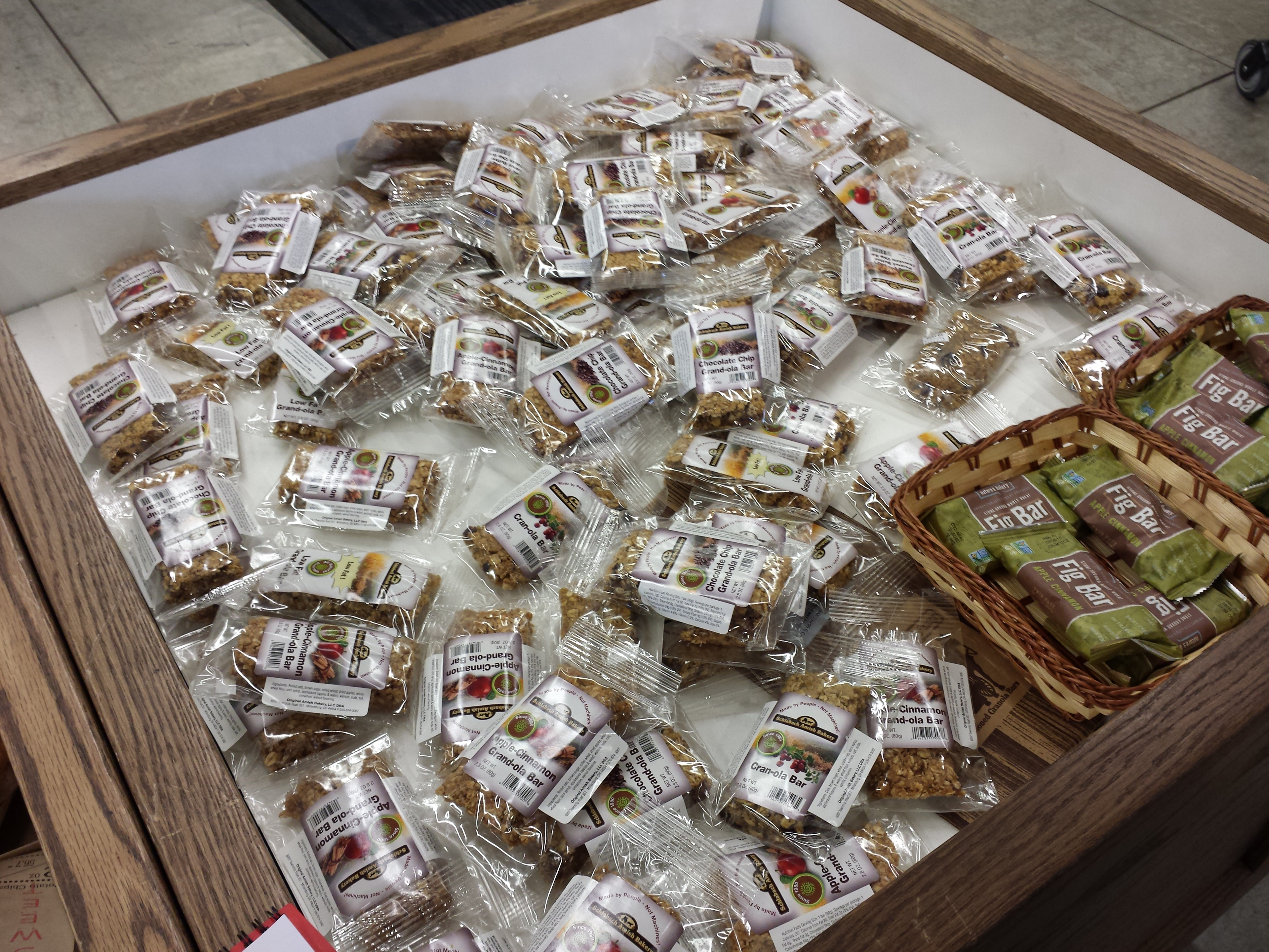
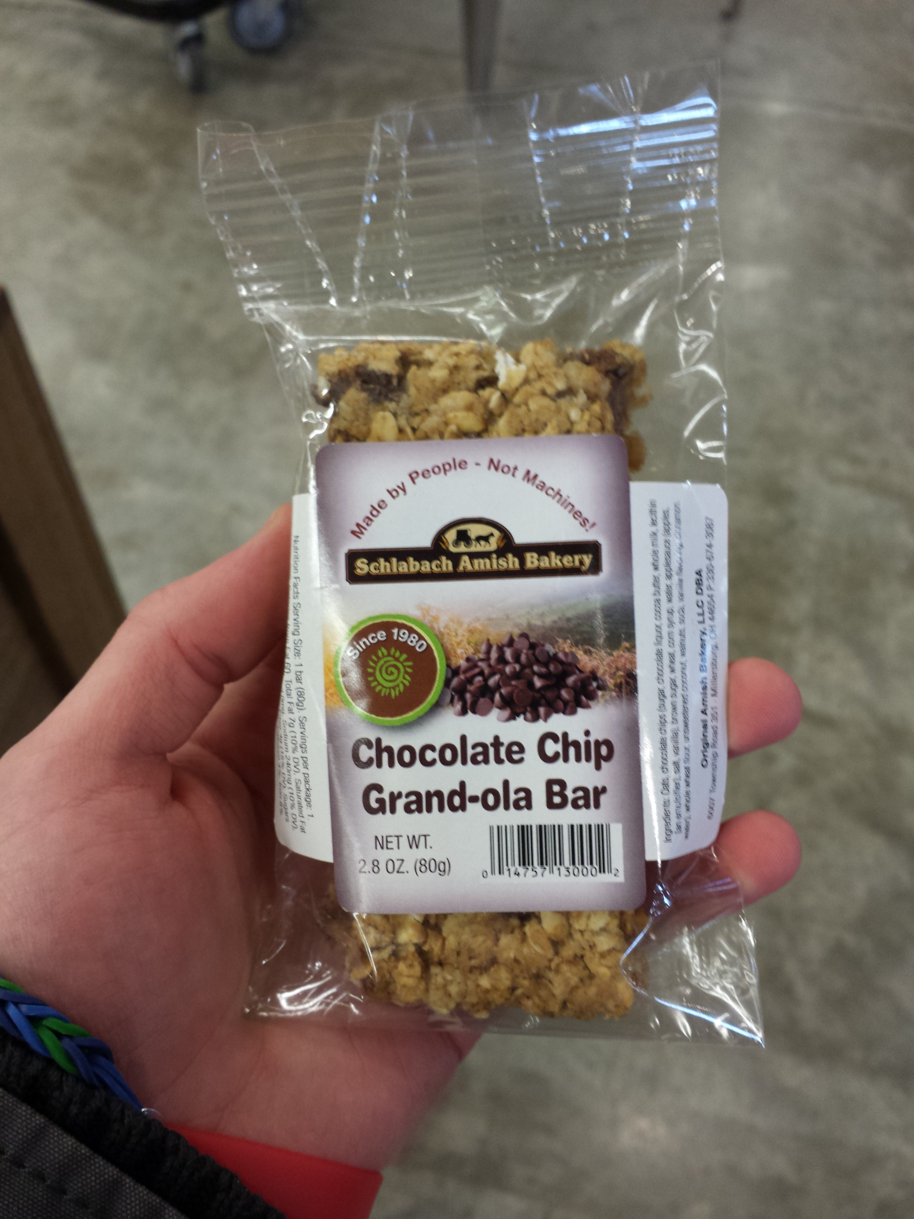
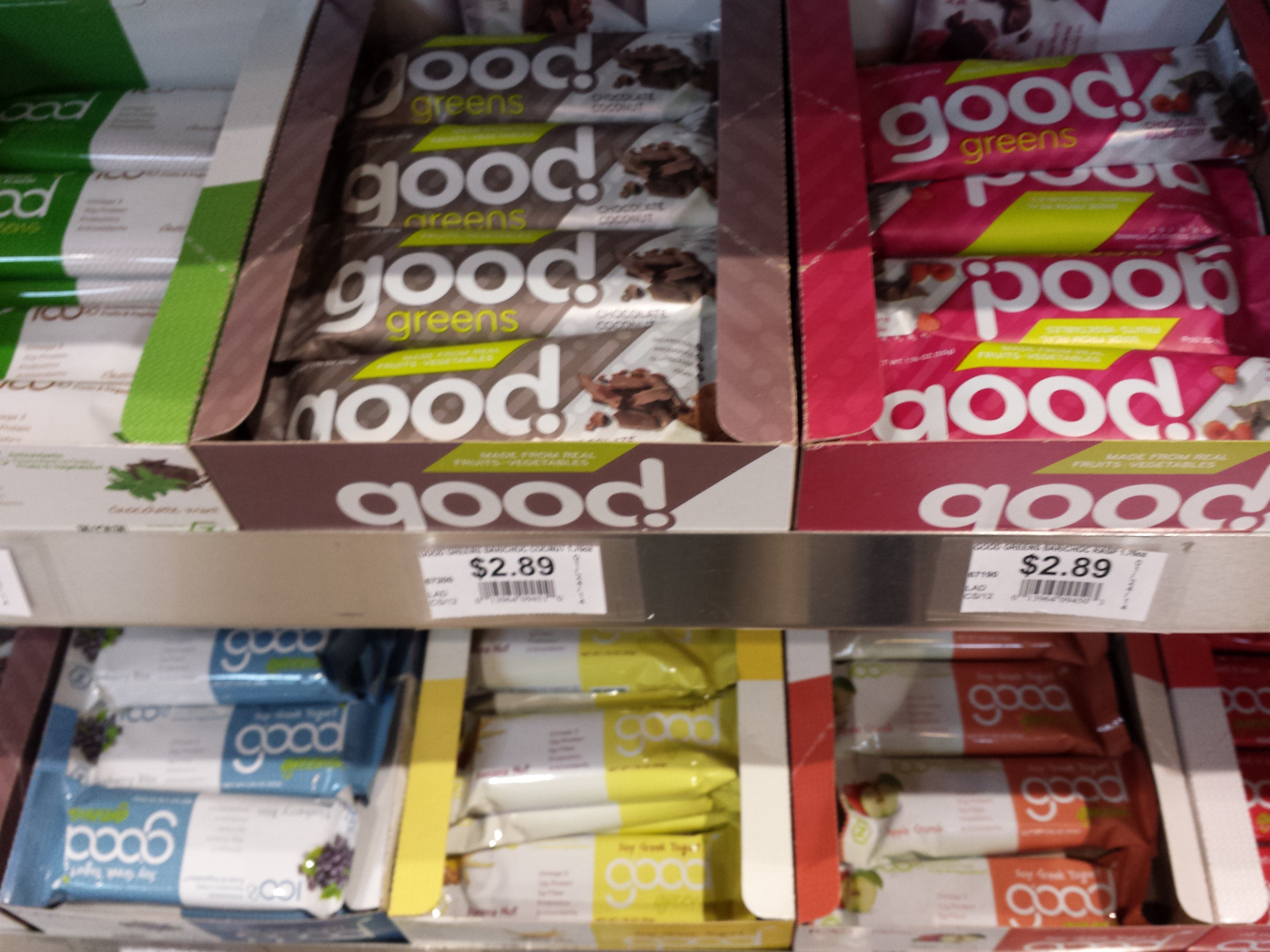
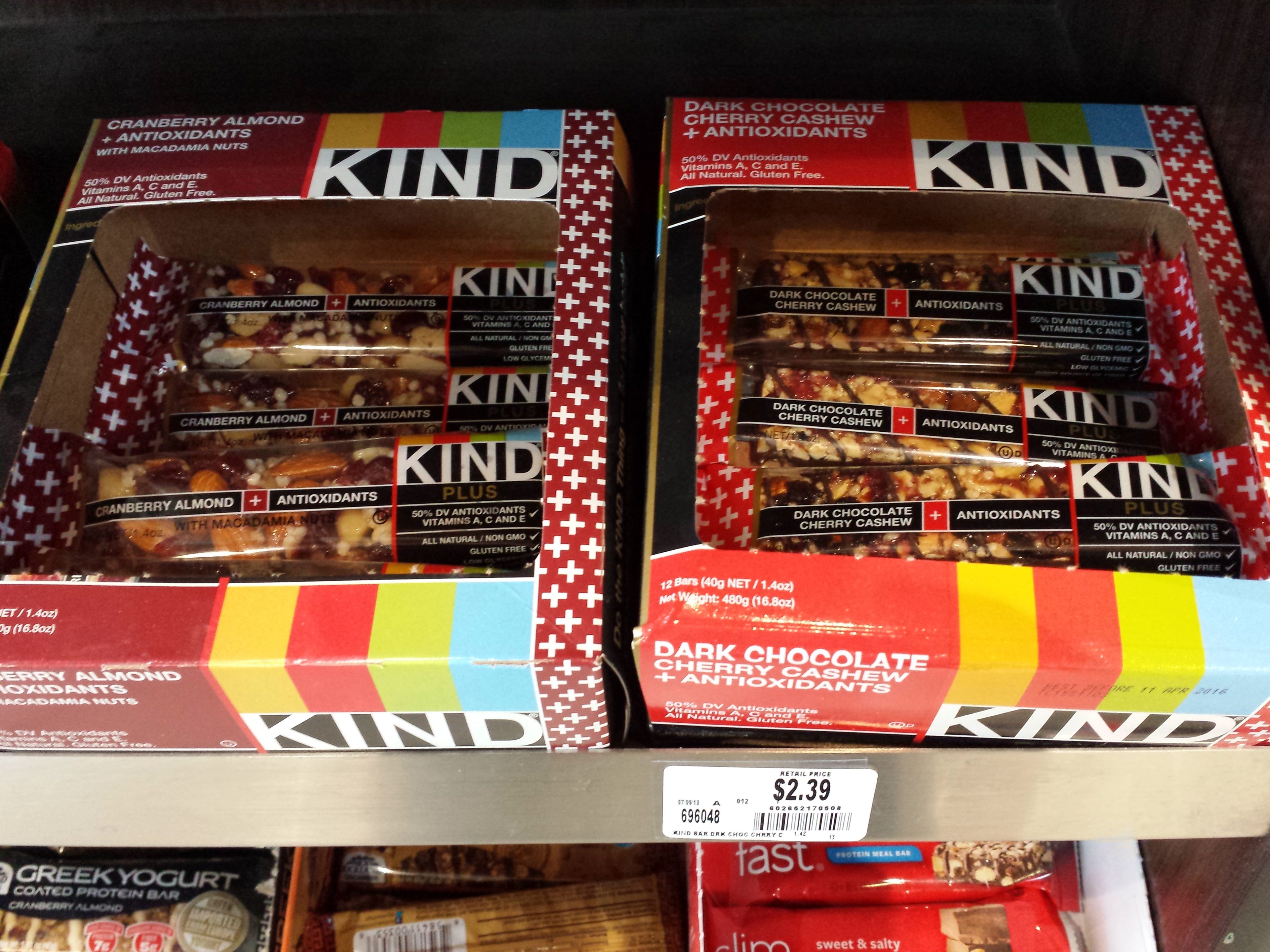
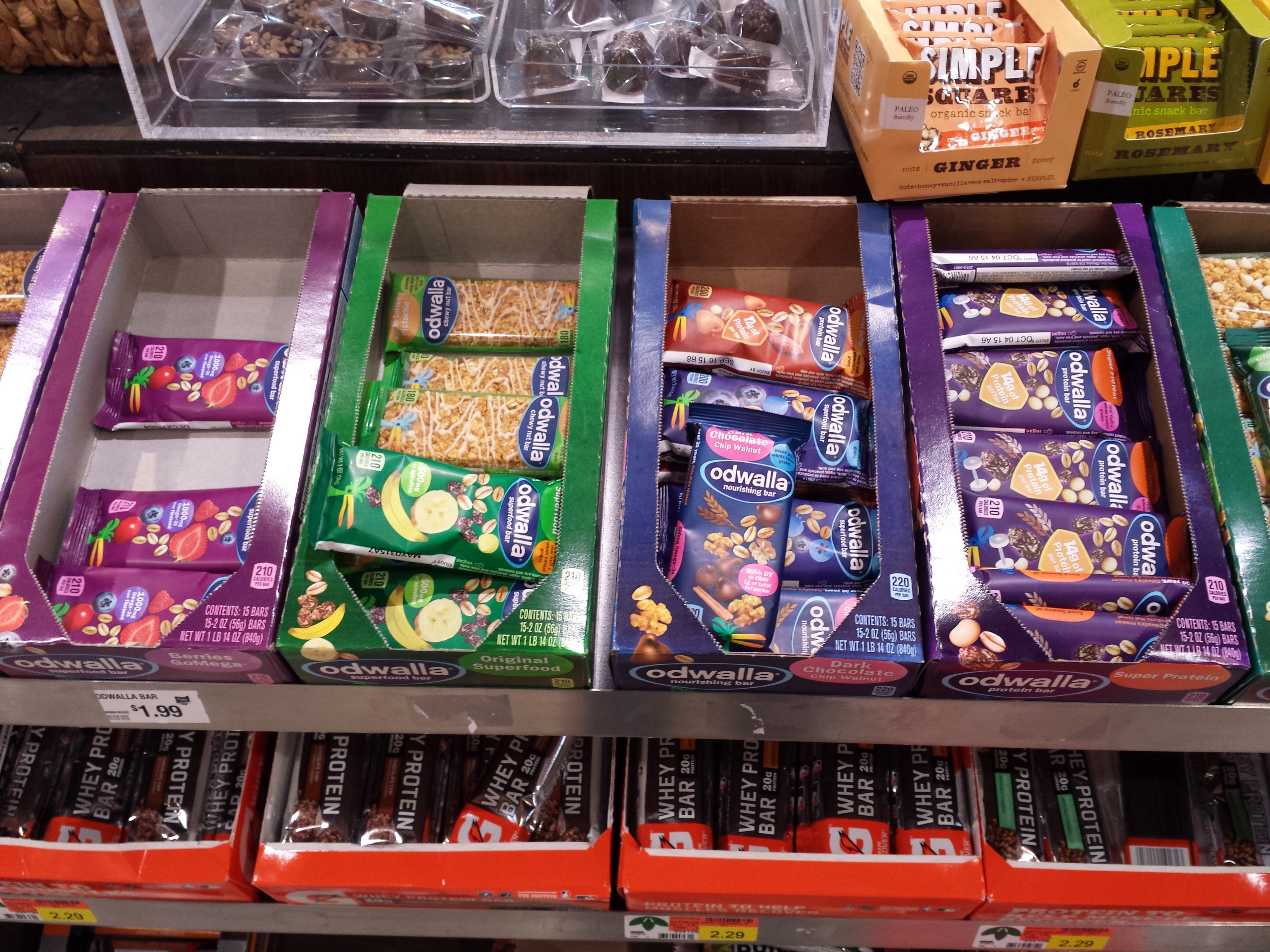
While the bars are processed manually, the current plastic packaging feels anything but hand-made. The presentation of the product didn't stack up to the neatly boxed and organized competitors, like KIND and LÄRABAR. The final design was heavily inspired by Jeremy Slagle's work on Ganola.
Paper, bamboo, and cork are consistent among eco-forward products, like with Boxed Water and the packaging JOCO Cups are shipped in.
Things done well
✅
- Clear package shows inside contents
- Handmade
- Strong seal and water resistant
- Heritage branding
- Flavor options
Areas to improve
🤔
- Difficult to open without scissors
- Contents move around spacious package
- Generic presentation without visual hierarchy
- Heavy use of plastic
- Flavor visual difference at a glance
Logo Refinement
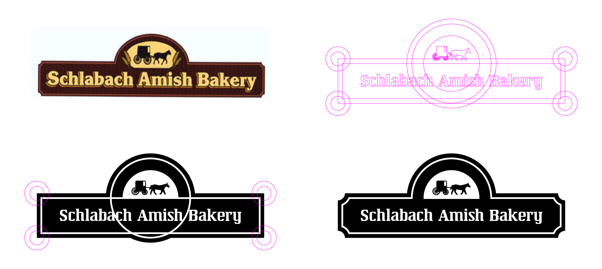
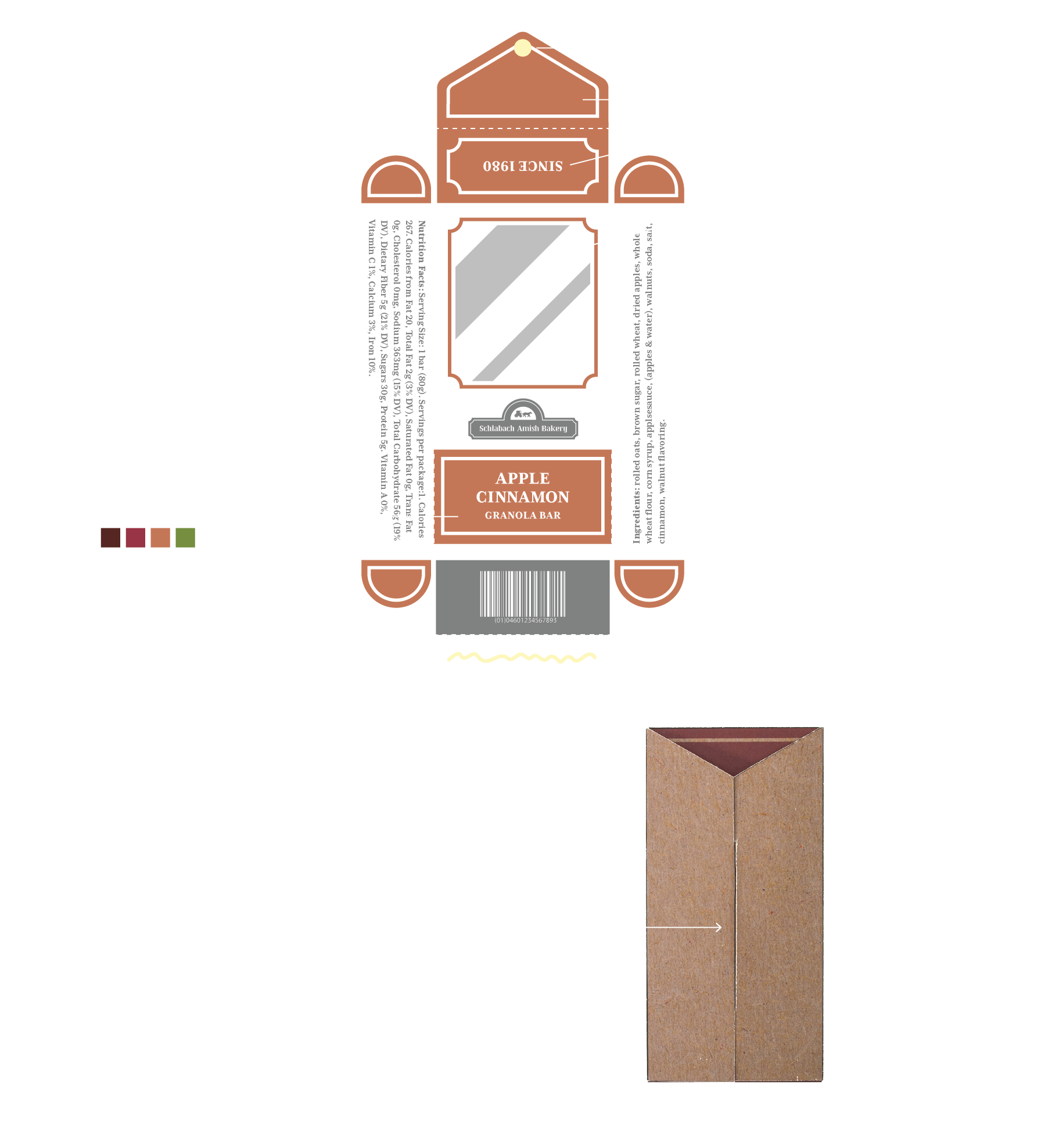
The logo was slightly revised to increase legibility at reduced sizes by thickening outlines, removing visual noise, and increasing contrast in colors. The logo was redesigned to work in a single color without the drop shadow effect to reduce ink costs.
Dieline
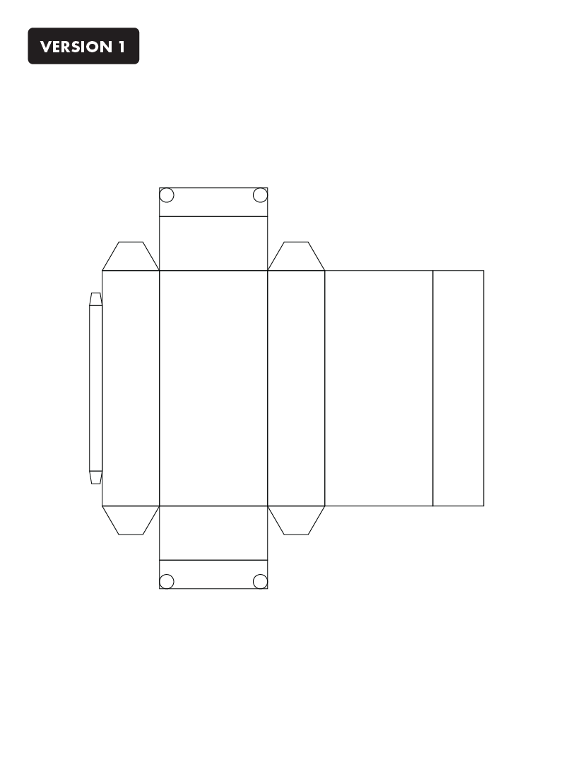
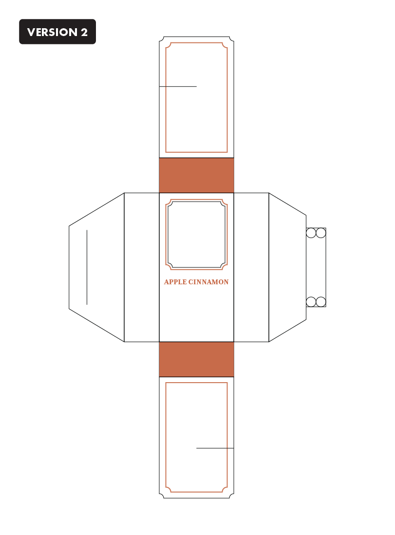
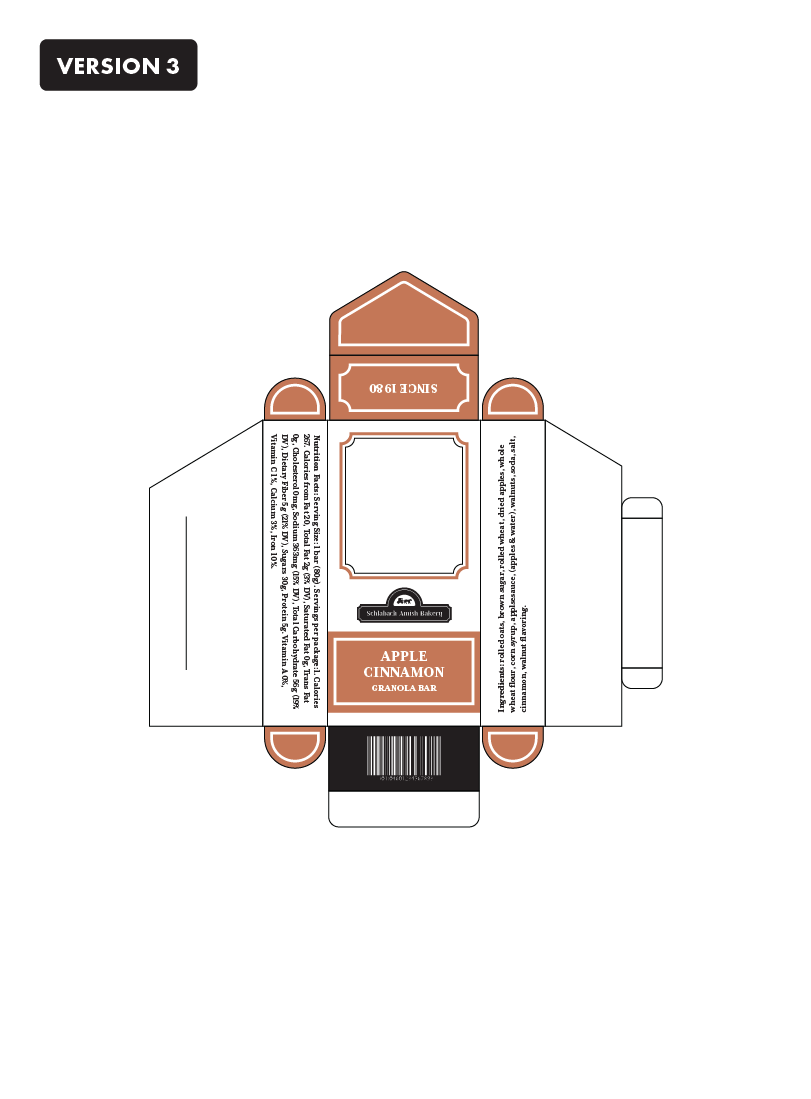
One piece of material could be assembled with interlocking flaps that create tension, avoiding the need for adhesives.
Challenges
- Hand-pressed bars are inconsistent in size
- Finding a middle-ground package size to prevent rattling or breakage during transportation and handling
Process
- Thinking through the folds conceptually
- Laying out the shapes in Illustrator
- Printing on copy paper
- Testing the folds
- Refine and repeat
Final

Home
Web
Branding
Product
About
Packaging
Case study
Granola Bar Pakaging
This granola bar packaging had 3 main criteria: visual uniqueness, desirability, and sustainability.
Objectives
Visual uniqueness
The package should stand out better than its competition at point-of-purchase.
Desirability
The package must improve desirability and recognition over the existing package design.
Environmental
The artwork should utilize 1-2 inks with sparing use of adhesives, relying more on mechanical closures.
Research
"Made by People - Not Machines"
While the bars are processed manually, the current plastic packaging feels anything but hand-made. The presentation of the product didn't stack up to the neatly boxed and organized competitors, like KIND and LÄRABAR. The final design was heavily inspired by Jeremy Slagle's work on Ganola.
Paper, bamboo, and cork are consistent among eco-forward products, like with Boxed Water and the packaging JOCO Cups are shipped in.
Things done well
✅
- Clear package shows inside contents
- Handmade
- Strong seal and water resistant
- Heritage branding
- Flavor options
Areas to improve
🤔
- Difficult to open without scissors
- Contents move around spacious package
- Generic presentation without visual hierarchy
- Heavy use of plastic
- Flavor visual difference at a glance
Logo Refinement
The logo was slightly revised to increase legibility at reduced sizes by thickening outlines, removing visual noise, and increasing contrast in colors. The logo was redesigned to work in a single color without the drop shadow effect to reduce ink costs.
Dieline
One piece of material could be assembled with interlocking flaps that create tension, avoiding the need for adhesives.
Challenges
- Hand-pressed bars are inconsistent in size
- Finding a middle-ground package size to prevent rattling or breakage during transportation and handling
Process
- Thinking through the folds conceptually
- Laying out the shapes in Illustrator
- Printing on copy paper
- Testing the folds
- Refine and repeat
Final
Home
Web
Branding
Product
About
Packaging
Case study
Granola Bar Pakaging
This granola bar packaging had 3 main criteria: visual uniqueness, desirability, and sustainability.
Objectives
Visual uniqueness
The package should stand out better than its competition at point-of-purchase.
Desirability
The package must improve desirability and recognition over the existing package design.
Environmental
The artwork should utilize 1-2 inks with sparing use of adhesives, relying more on mechanical closures.
Research
"Made by People - Not Machines"
While the bars are processed manually, the current plastic packaging feels anything but hand-made. The presentation of the product didn't stack up to the neatly boxed and organized competitors, like KIND and LÄRABAR. The final design was heavily inspired by Jeremy Slagle's work on Ganola.
Paper, bamboo, and cork are consistent among eco-forward products, like with Boxed Water and the packaging JOCO Cups are shipped in.
Things done well
✅
- Clear package shows inside contents
- Handmade
- Strong seal and water resistant
- Heritage branding
- Flavor options
Areas to improve
🤔
- Difficult to open without scissors
- Contents move around spacious package
- Generic presentation without visual hierarchy
- Heavy use of plastic
- Flavor visual difference at a glance
Logo Refinement
The logo was slightly revised to increase legibility at reduced sizes by thickening outlines, removing visual noise, and increasing contrast in colors. The logo was redesigned to work in a single color without the drop shadow effect to reduce ink costs.
Dieline
One piece of material could be assembled with interlocking flaps that create tension, avoiding the need for adhesives.
Challenges
- Hand-pressed bars are inconsistent in size
- Finding a middle-ground package size to prevent rattling or breakage during transportation and handling
Process
- Thinking through the folds conceptually
- Laying out the shapes in Illustrator
- Printing on copy paper
- Testing the folds
- Refine and repeat
Final