Customer
• 60 year-old man
• corporate professional
• lives in Columbus, OH
• enjoys coffee but has never bought coffee beans before
• likes supporting small independent businesses

Research and inspiration
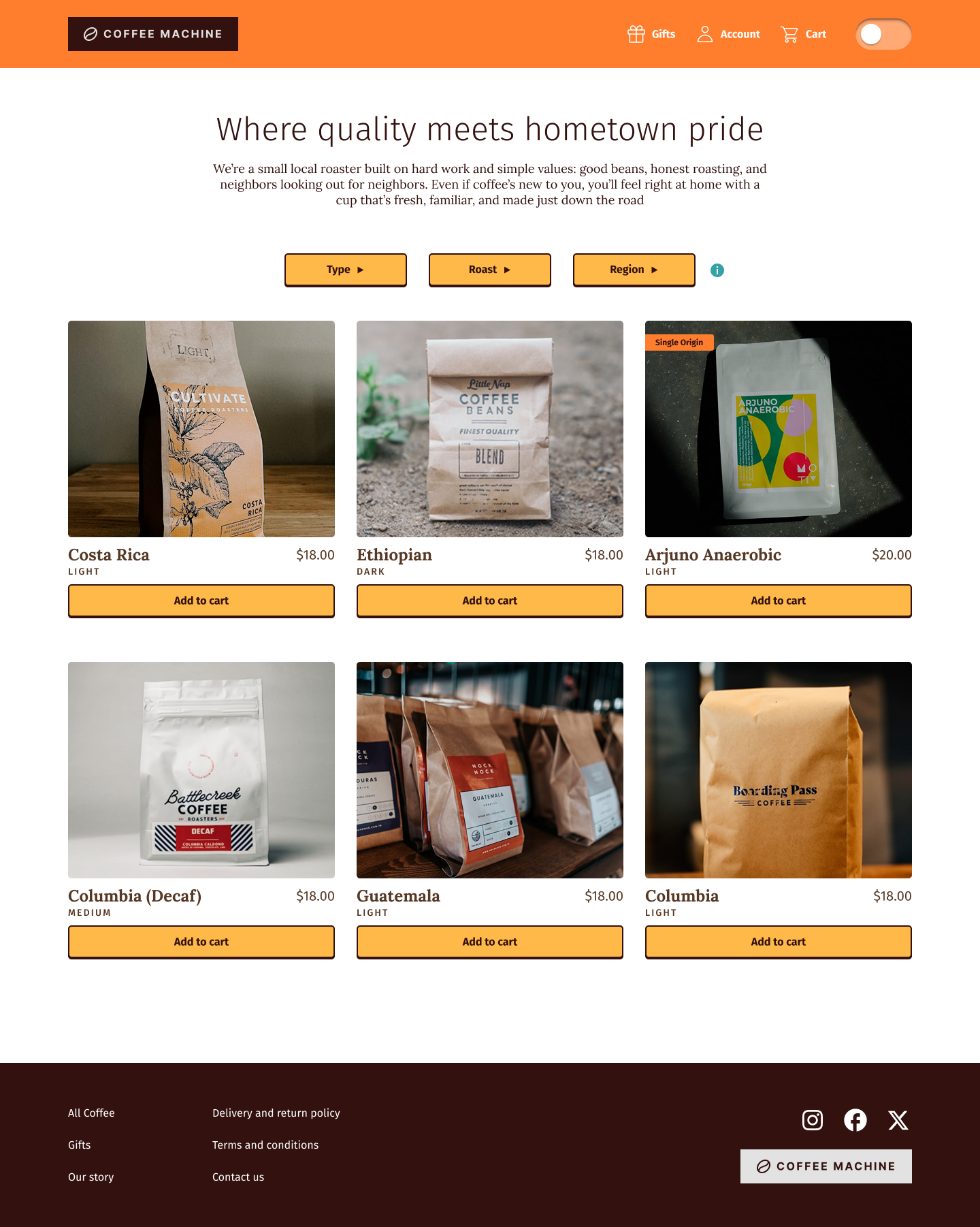
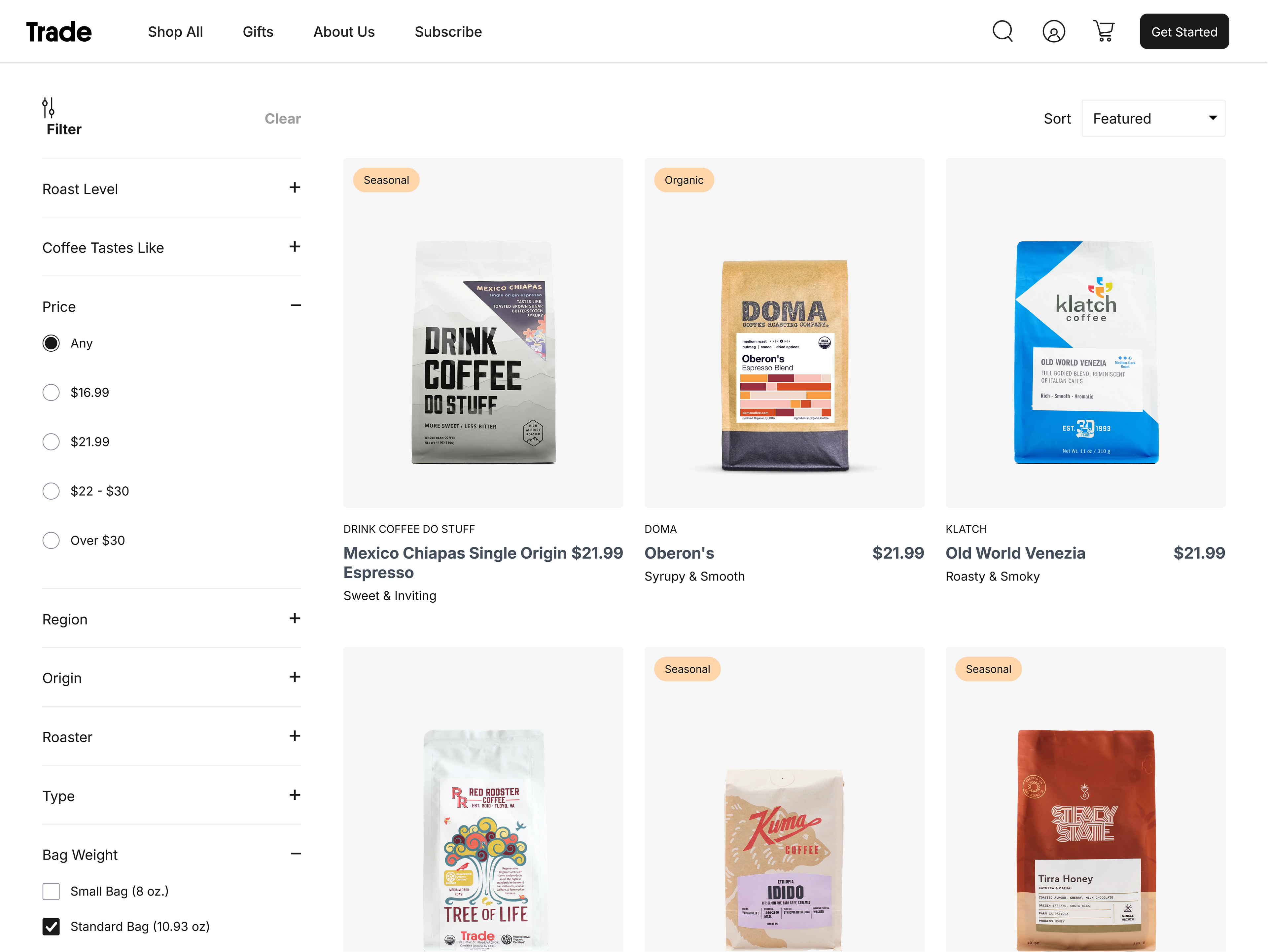
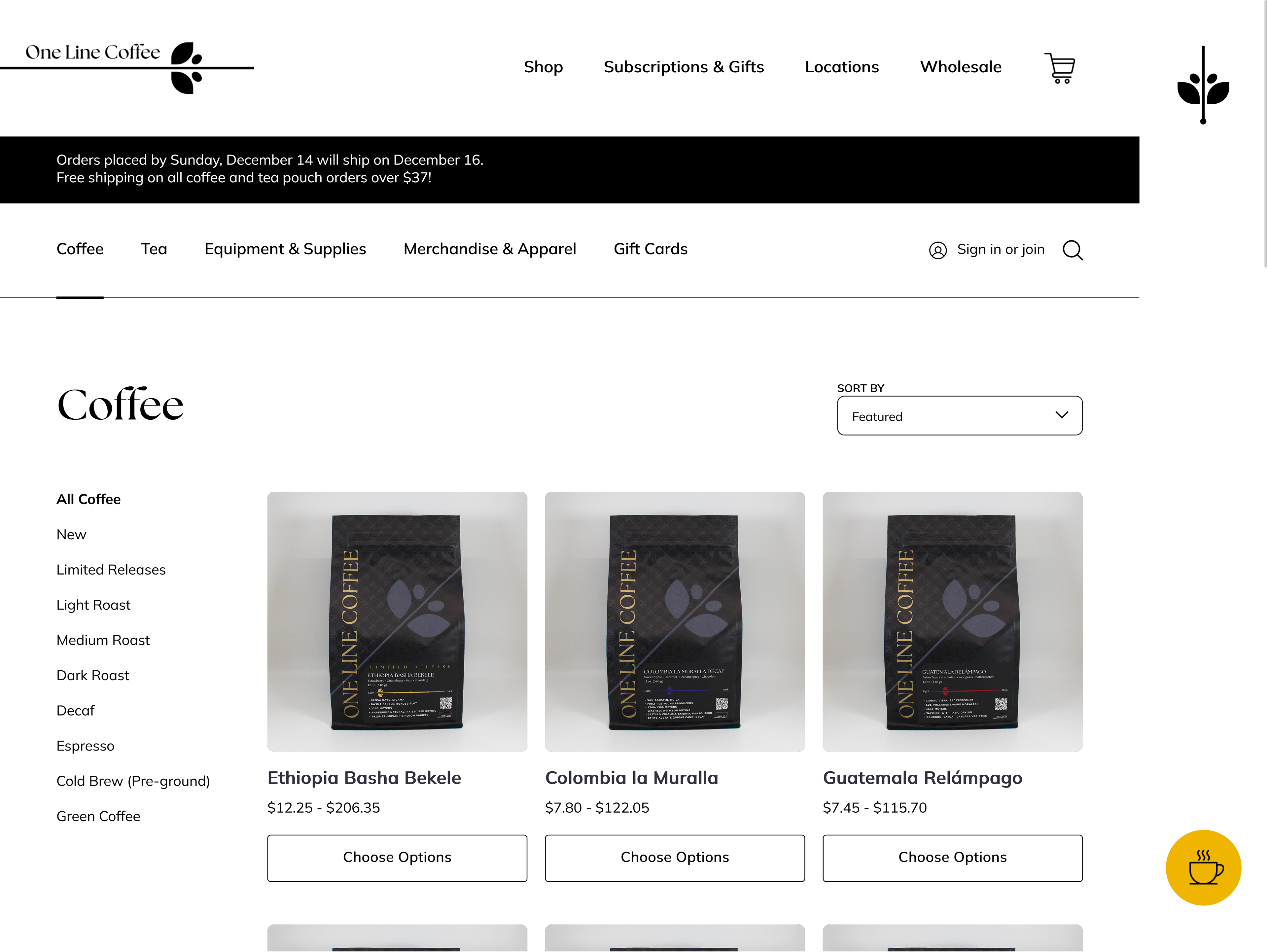
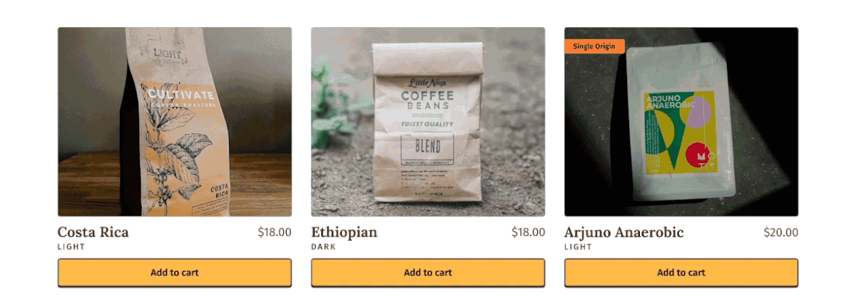
Coffee shop and roastery websites I reviewed as part of my research included Trade, One Line, Redemption Roasters, and Onyx. All of them had a page where the coffee options were presented in a grid format containing pictures, text about the coffee, and the price.
Something surprising that was consistently missing was a quick add-to-cart button, which would be useful for returning customers or buying simply based on the price point and the label, similar to wine shopping.
Wireframes
The initial wireframes explored the general page layout and navigation items on mobile. Later, the mobile navigation was significantly reduced to a cart and menu icon to remove visual clutter and consolidate actions, such as removing the home icon in favor of the logo sending the user back to the homepage.
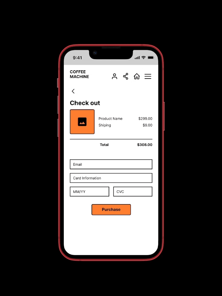
User Flow
Homepage > Product details > Checkout > Confirmation
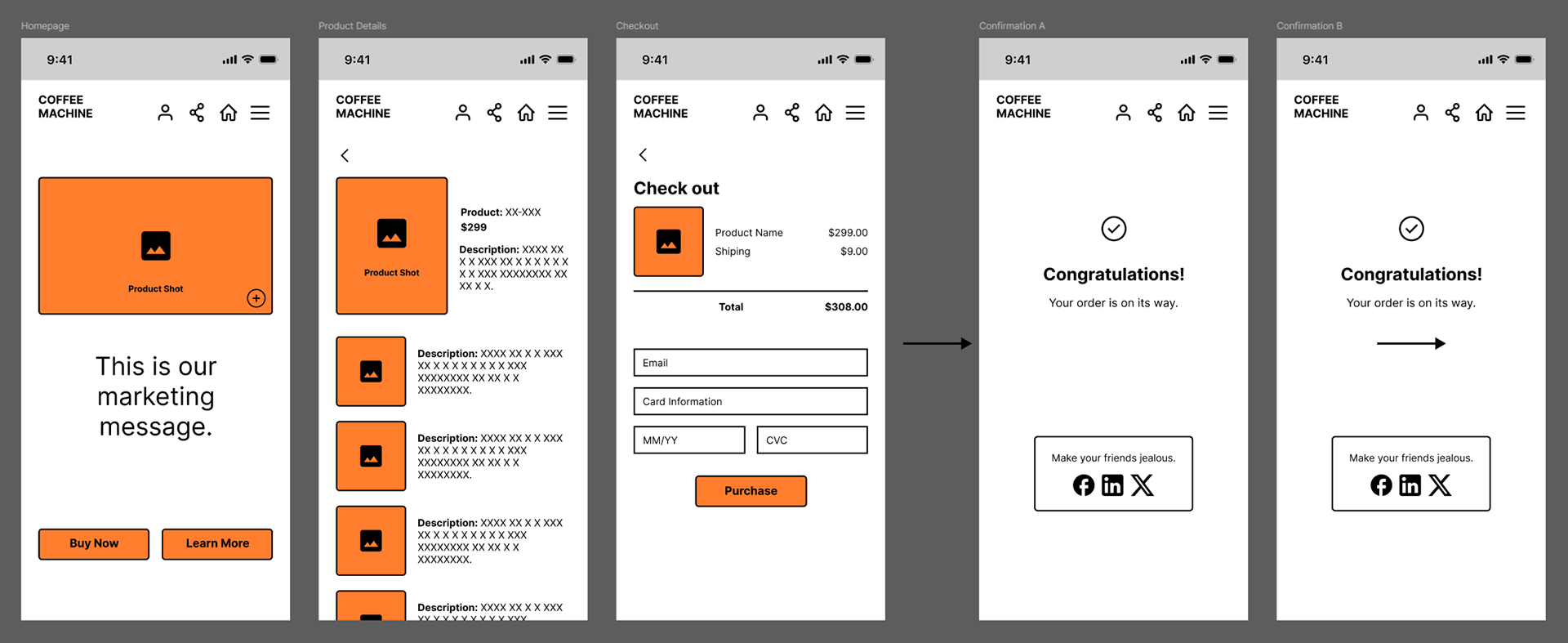
Instead of "Learn more" taking up additional real estate, it was integrated into a hover state on the images.
Button animation
Skeuomorphic design has been shown to be more intuitive for new and older users. This was brought into the buttons to give a subtle dimensional and tactile feel.
To build the component in Figma, I created a frame inside of a frame, centering the text within the inside frame. The inside frame was made slightly smaller with a 2px stroke spread of 0 and a Y offset of 2. A second 2px stroke was applied to the outer frame.

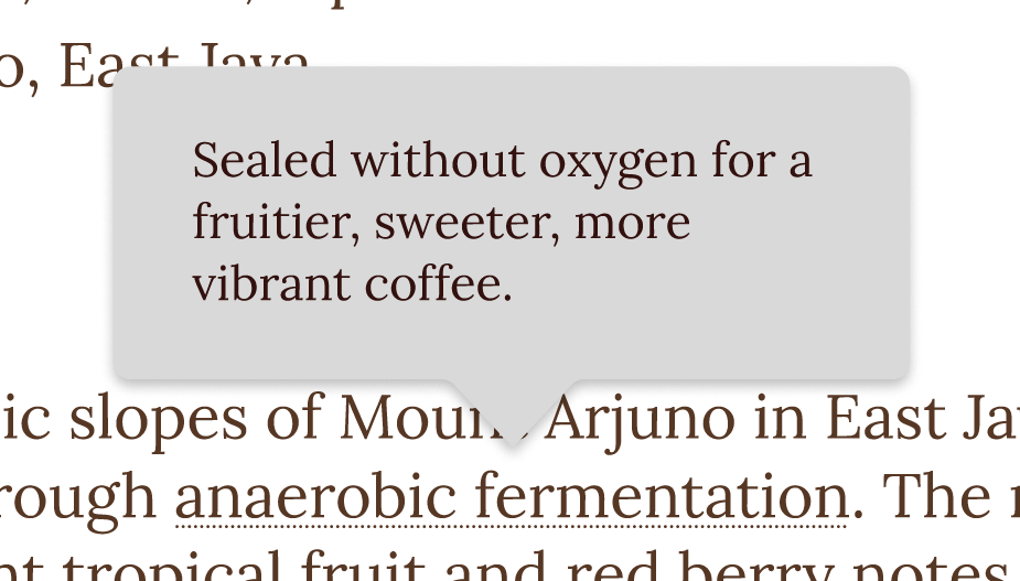
Tooltips
Coffee terminology can be overwhelming for first-time buyers. It can be unclear what "light roast" or "single origin" mean and how these affect the flavor and quality. Adding tooltips that appear on hover or tap on mobile much like Wikipedia does quickly closes the knowledge gap contextually.