Objectives
• Modernize the color palette
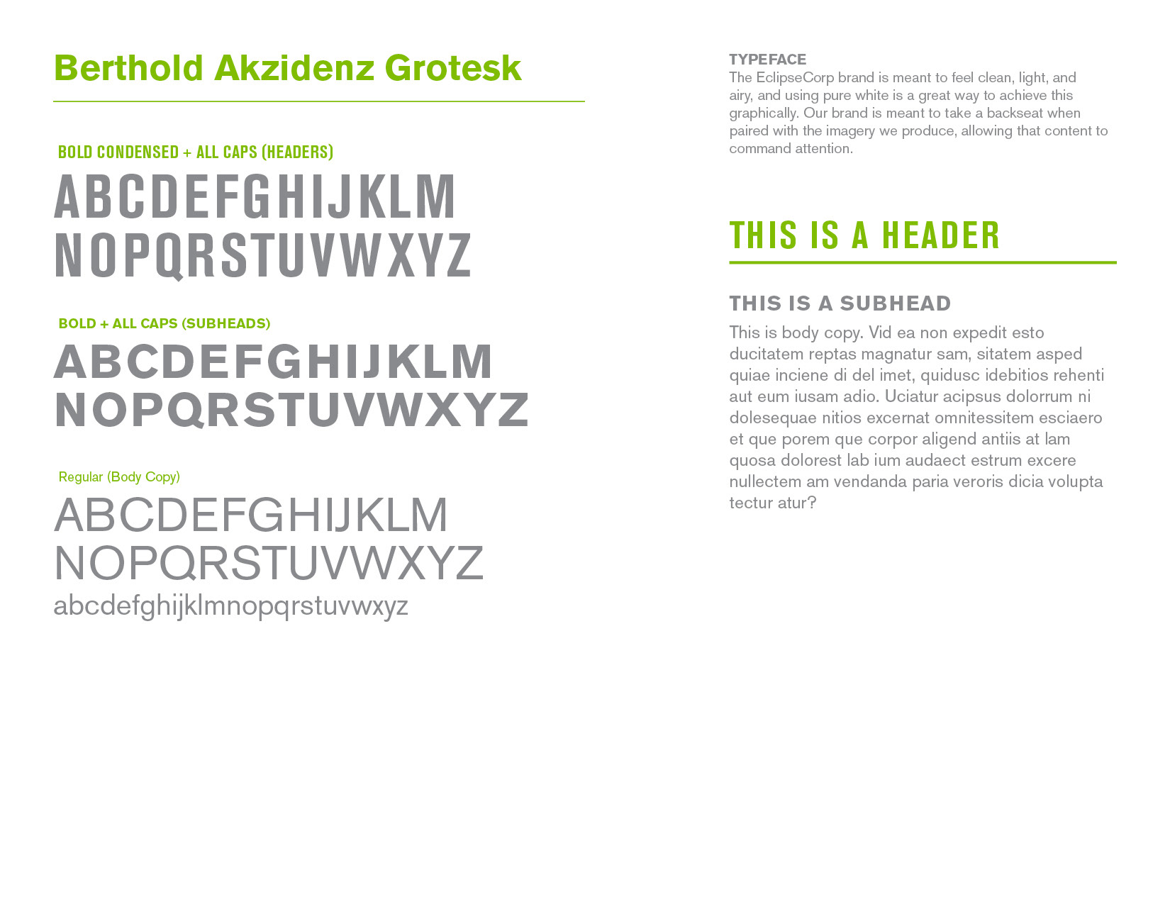
• Maintain the original typeface
• Increase legibility of the logomark (EC) at reduced sizes for social media applications
• Unify the separate business services under one parent company and brand
• Create a simple and consistent design system
• Maintain the original typeface
• Increase legibility of the logomark (EC) at reduced sizes for social media applications
• Unify the separate business services under one parent company and brand
• Create a simple and consistent design system
Logo
We explored many iterations as a team and revised the logo almost a dozen times to get it just right, testing color schemes, typefaces, and accent symbols. We even tried reviving elements of an older version of the logo (like Nationwide reviving the eagle). Ultimately, we decided to maintain the recognizable EC monogram, but house it inside a circle to better pair with the roundness of the wordmark and generally reference the “eclipse” element of the name.
video filming & editing – Jared Miller
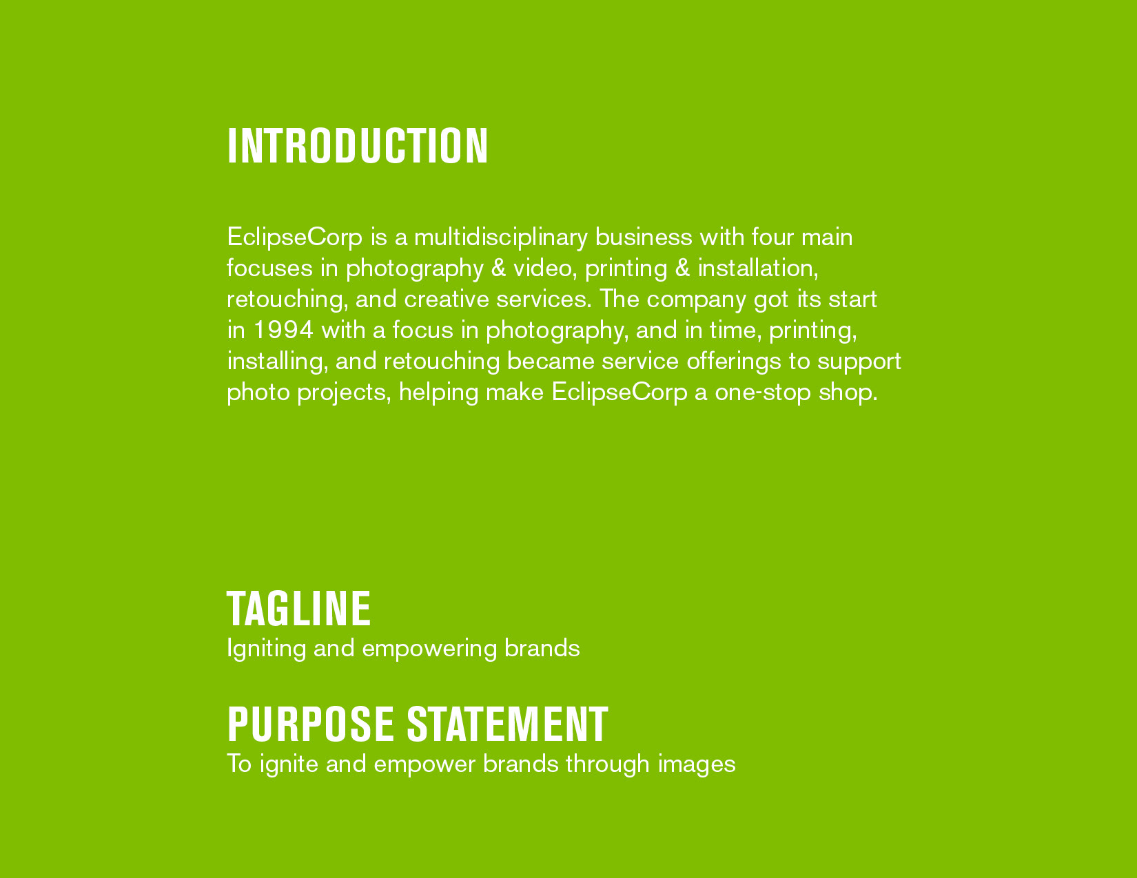
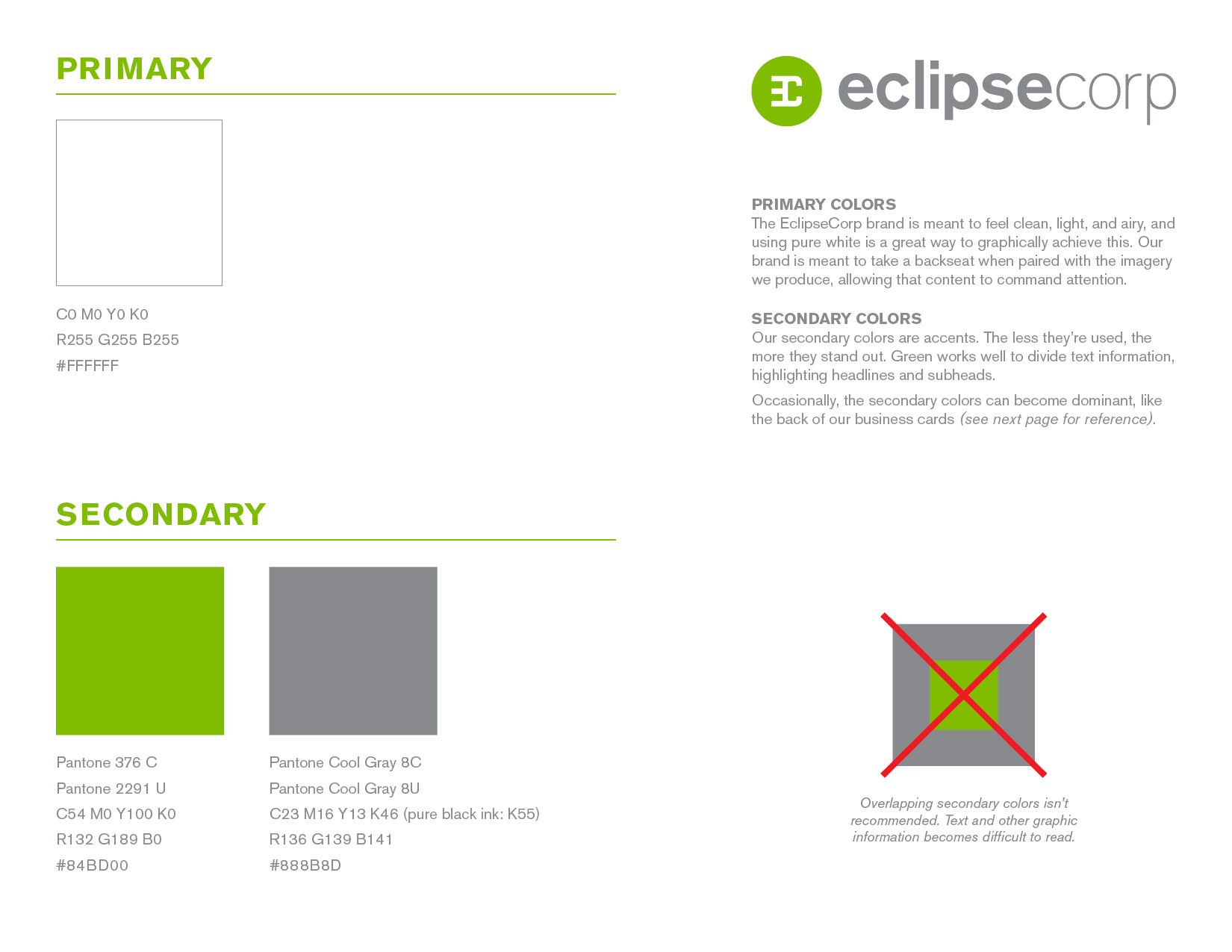
Brand Guide
After the logo was designed, we were able to create the rule book to inform the rest of the brand.


Applications
Van decals
After a given project is printed by EclipseCorp, installers bring the graphics to their intended environments. Designing the van decals presented the greatest opportunity for error due to the unique shape. I took many measurements to redraw the faces of the vehicle in Illustrator to ensure graphics wouldn't be unintentionally cropped by windows, tires, and various seams.
Mailer
Before the rebrand, most clients only used one EclipseCorp service at a time. For example, they might send photos for retouching, then go to another company for printing without realizing EclipseCorp could handle photography, retouching, and printing as one complete project. Using a single provider would save clients money and time, with one point of contact managing the whole process. The mailer was designed to highlight this benefit and encourage clients to think about combining services.
Grid use to ensure text baseline alignment
Website
I designed the website and worked with a developer to bring it to life. Much of the website needed to be treated like a portfolio to showcase the work EclipseCorp could do for potential clients. One feature the developer and I collaborated on closely was an interactive before and after image slider, negotiating what was feasible with CSS at the time. This let viewers drag a line across photos to see the original image compared to the retouched version and get an understanding of the team’s editing skills in a hands-on way.

