Objectives
• Visual uniqueness: The package should stand out better than its competition at point-of-purchase.
• Desirability: The package must improve desirability and recognition over the existing package design.
• Environmental: The package must be designed with environmental impact in mind.
Production constraints
• The package must be a folded die-cut box.
• The artwork on the package can only utilize 1-2 colors and use ink sparingly.
• Reduce the use of adhesives and rely more on mechanical connections and closures.
• Reduce the amount of material used, and create optimal die-lines with minimal waste.
• Reduce the volume of the package if possible without negatively impacting the aesthetic quality.
Artwork requirements
• Logo
• Product name/description
• Nutrition information adhering to FDA guidelines
• Barcode
• Representation of basic copyright and trademark text
Research
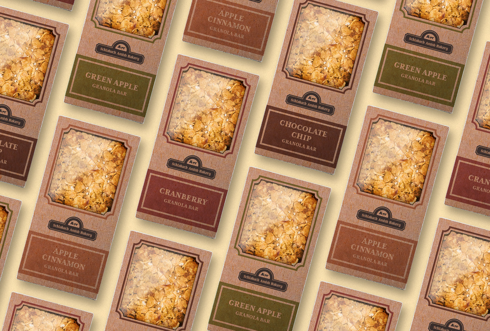
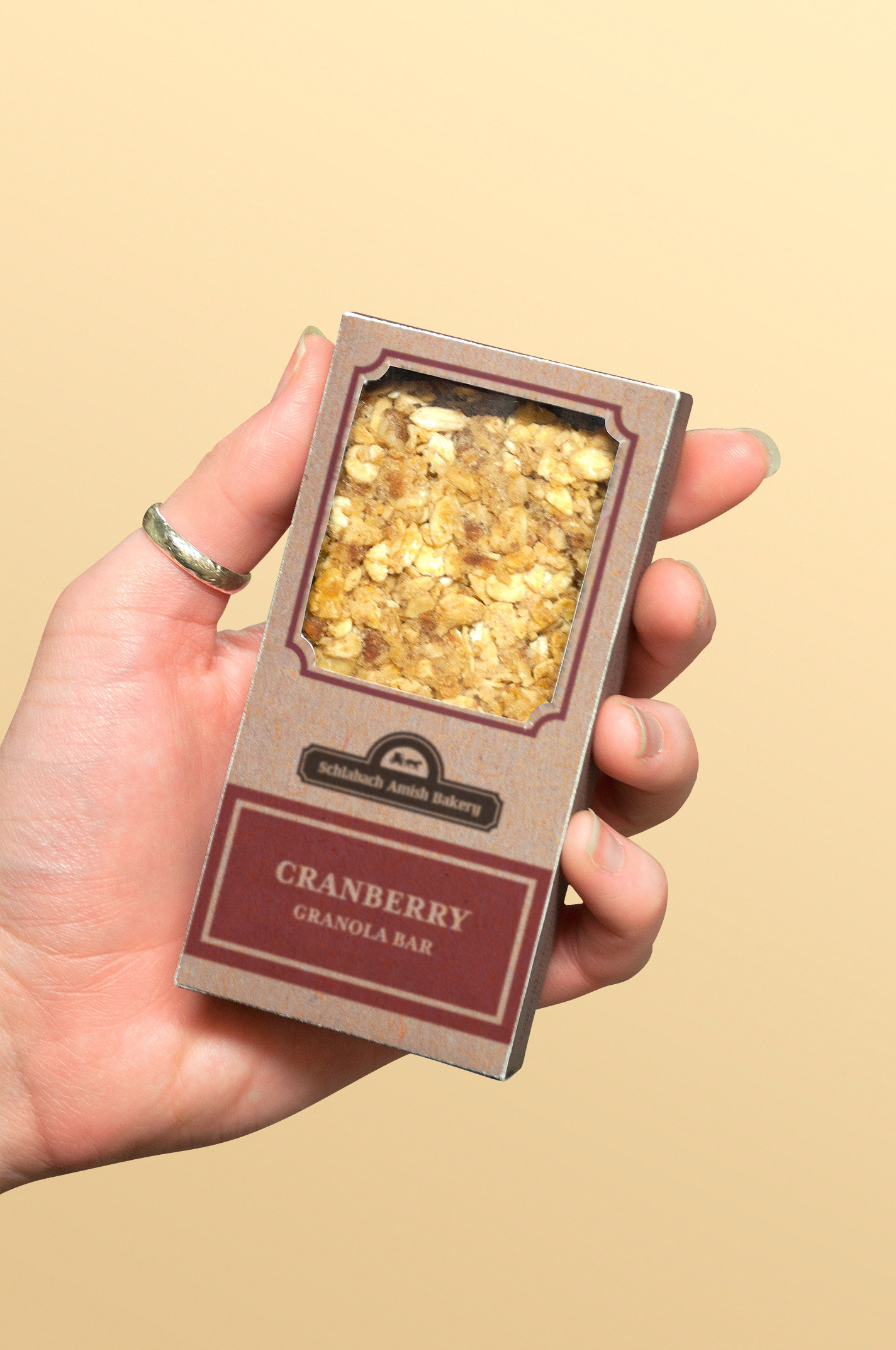
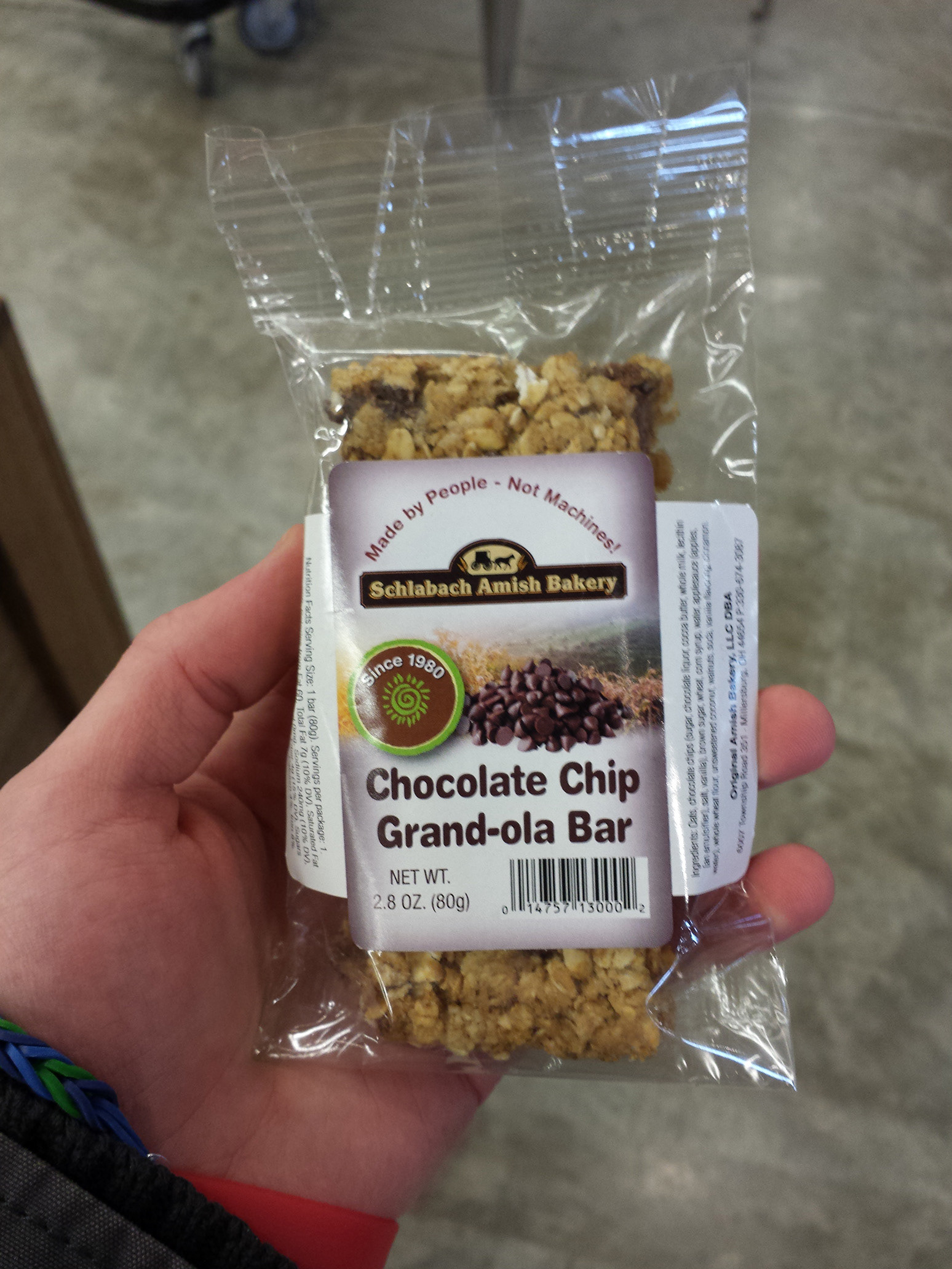
"Made by People - Not Machines"
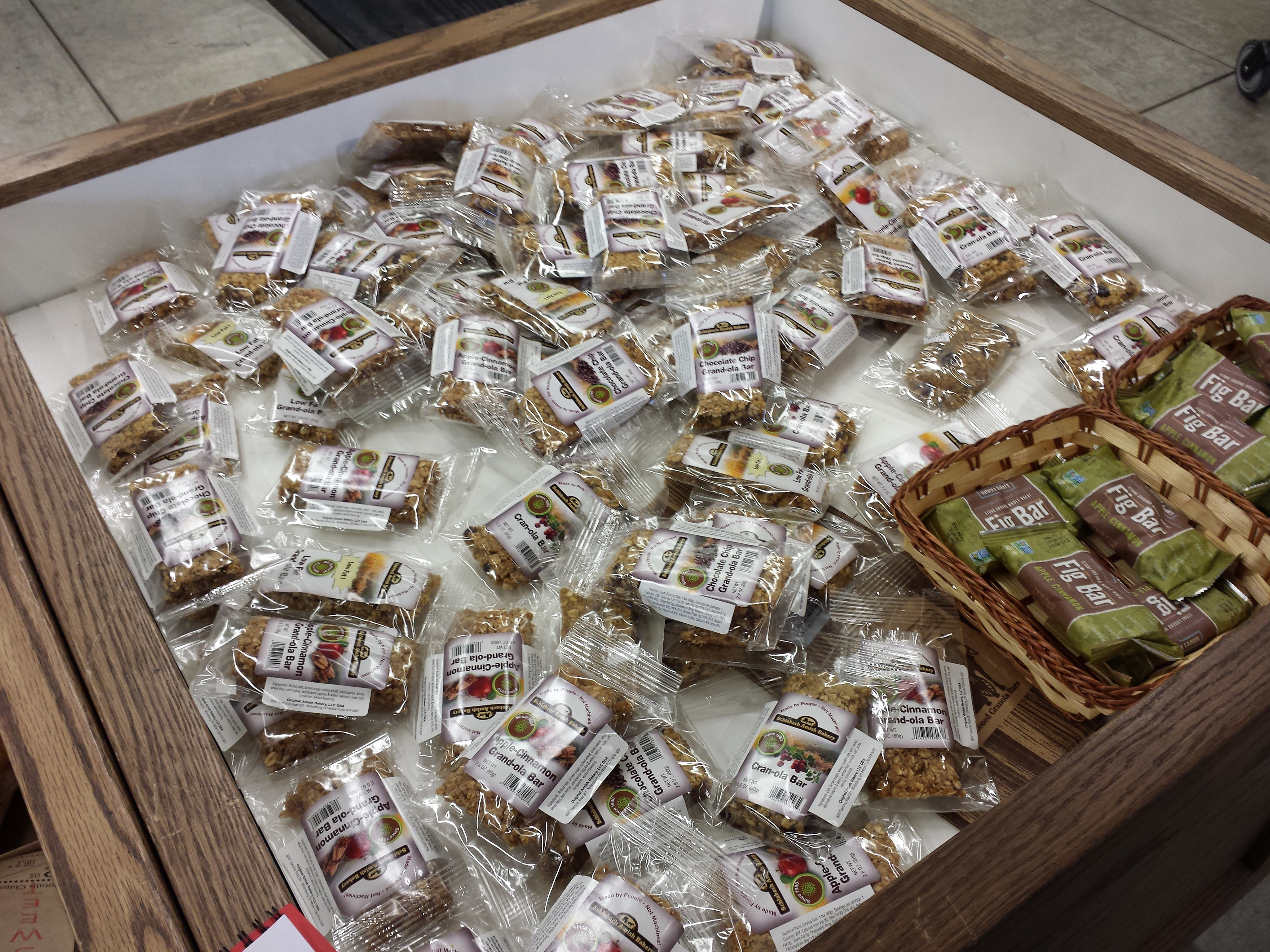
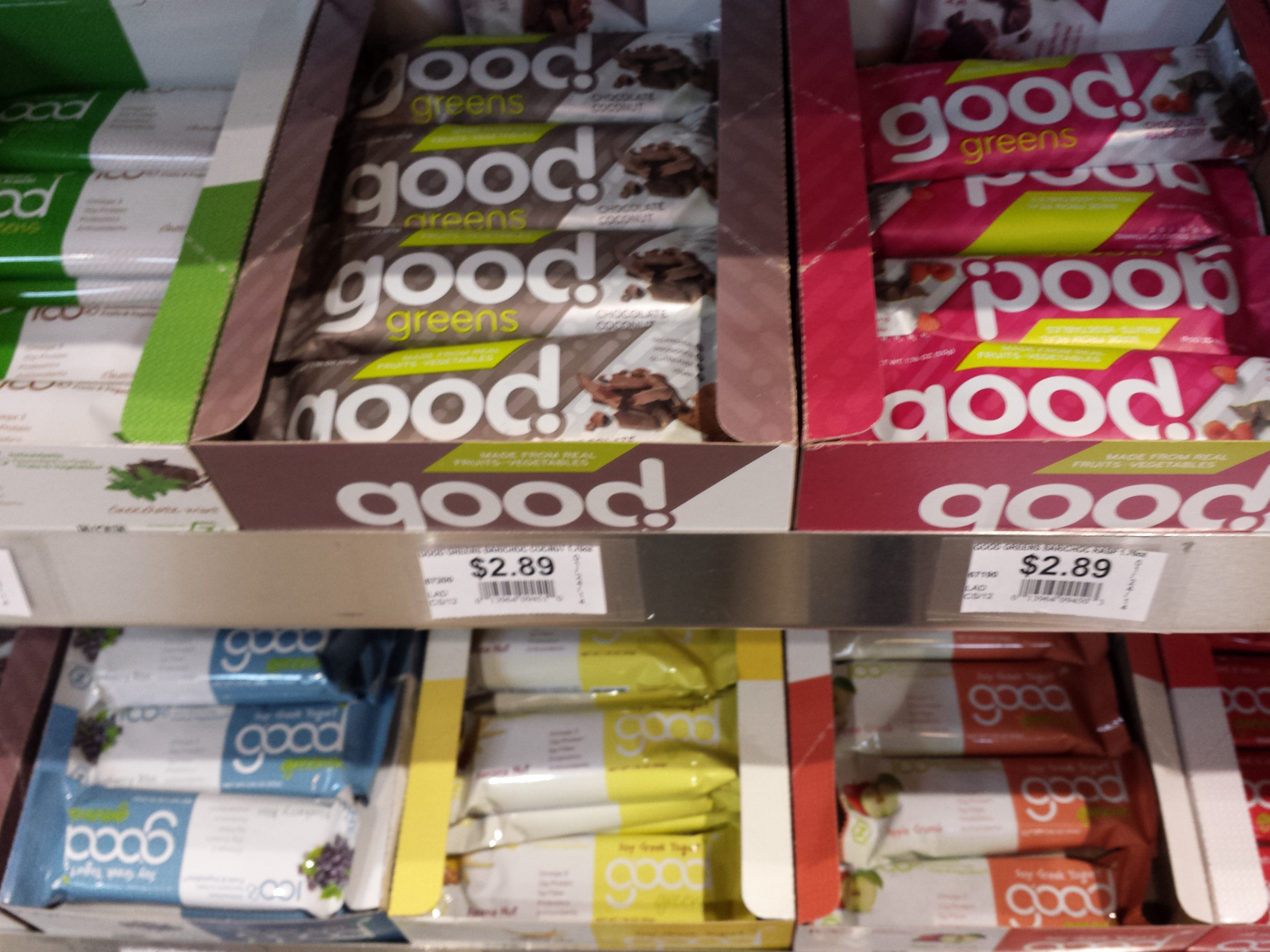
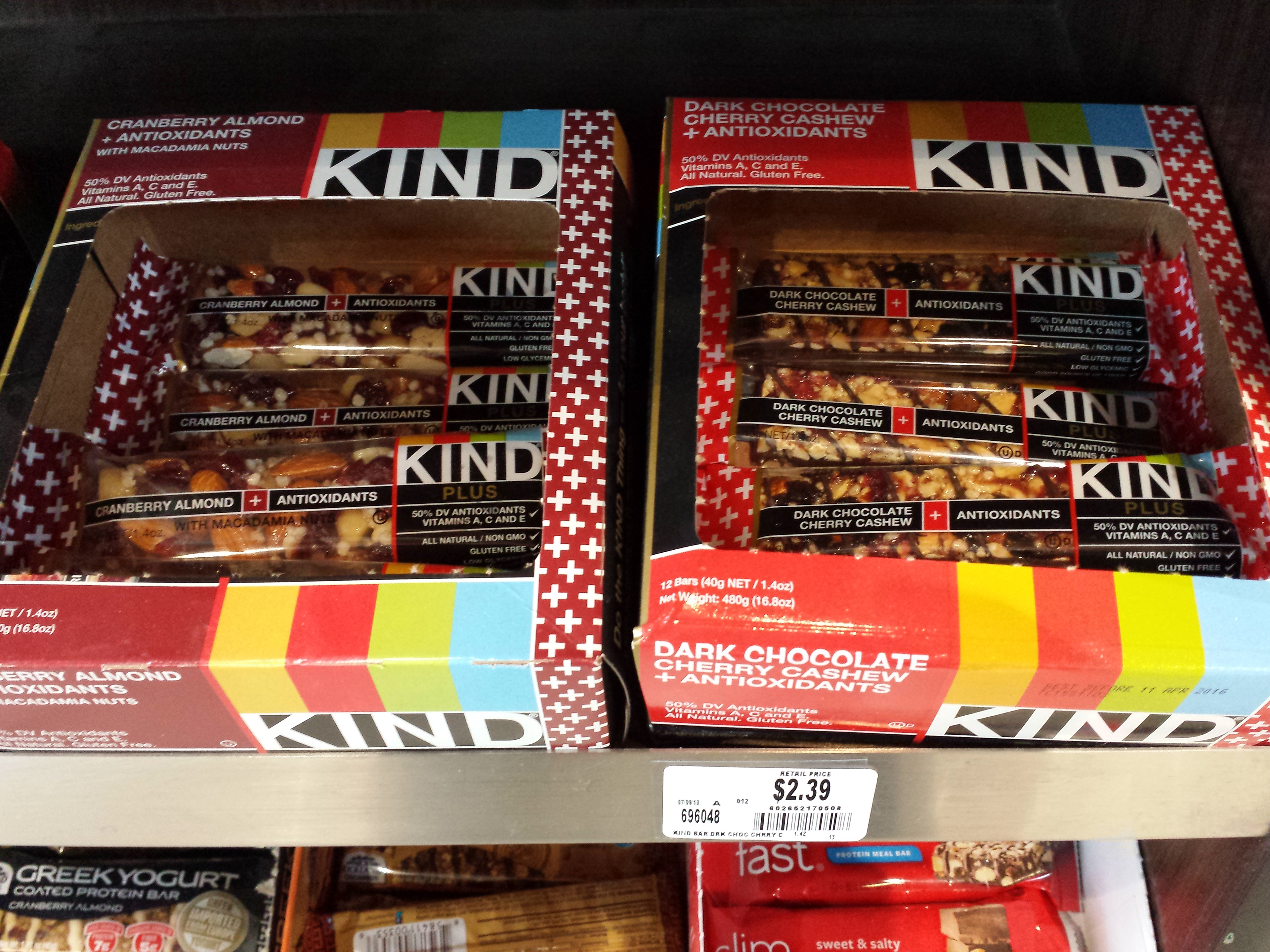
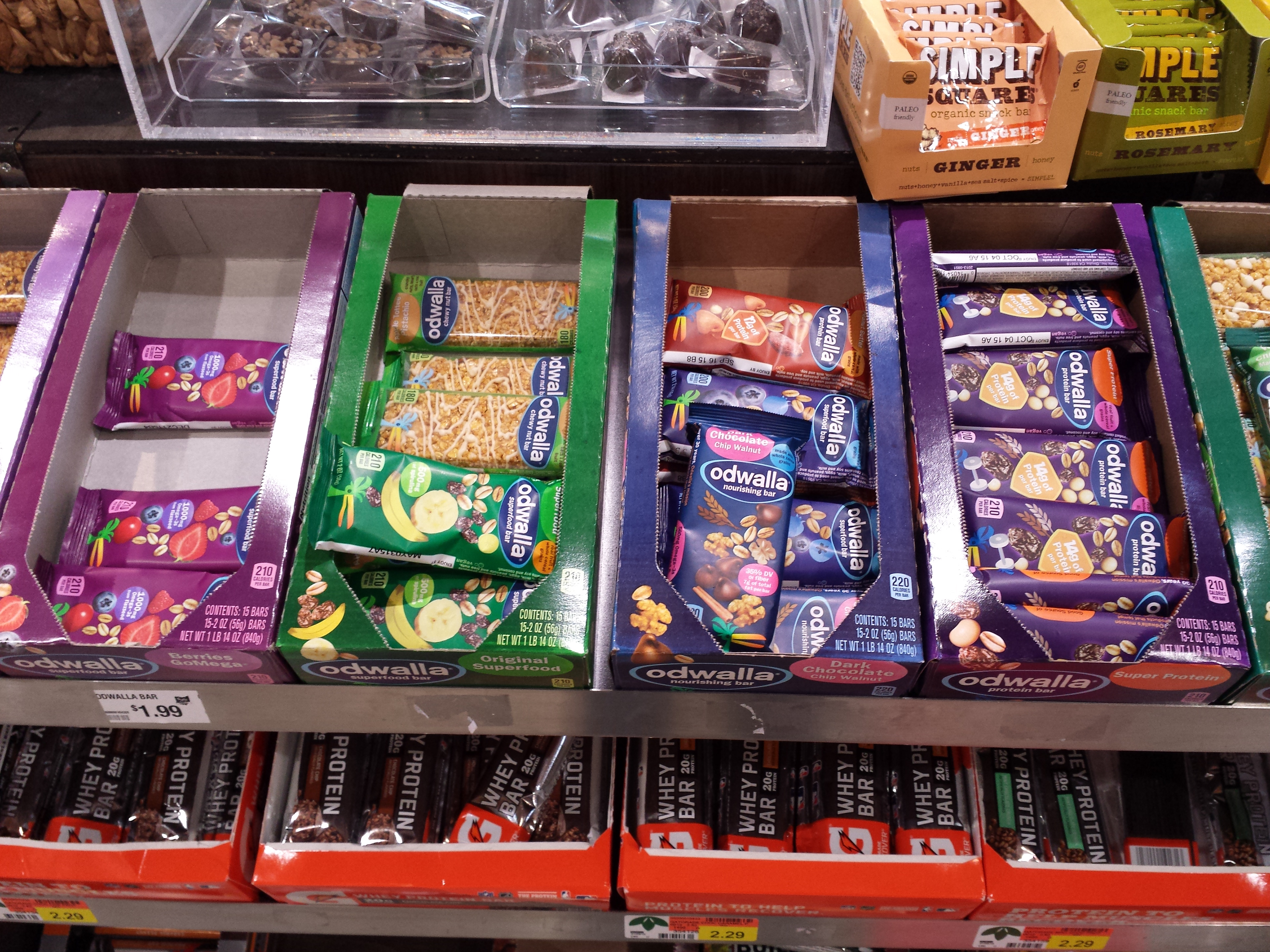
While the bars are processed manually, the original plastic packaging felt anything but hand-made. The presentation of the product didn't stack up to the neatly boxed and organized competitors, like KIND and LÄRABAR. The final design was heavily inspired by Jeremy Slagle's work on Ganola.
When researching sustainable packaging materials, paper, bamboo, and cork were consistent among eco-forward products, like with Boxed Water and the packaging JOCO Cups are shipped in.
Things done well
• Clear package shows inside contents
• Handmade
• Strong seal and water resistant
• Heritage branding (since 1980)
• Flavor options
Areas to improve
• Difficult to open without scissors
• Contents move around spacious package
• Generic presentation without visual hierarchy
• Heavy use of plastic
• Flavor visual difference at a glance
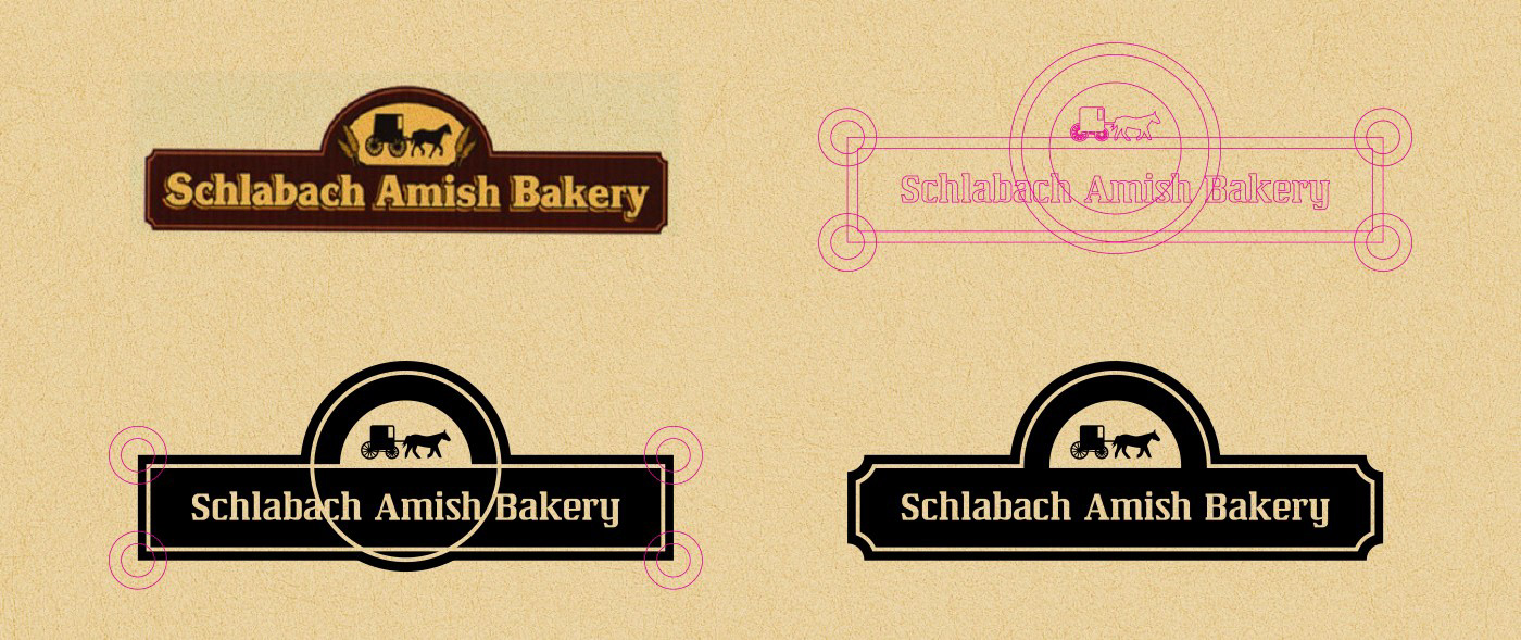
Logo refinement
The logo needed minor revising to increase legibility at reduced sizes by thickening outlines, removing the grain on either side of the horse and buggy, and increasing contrast in colors. The logo also needed to work in a single color without the drop shadow effect to reduce ink costs.
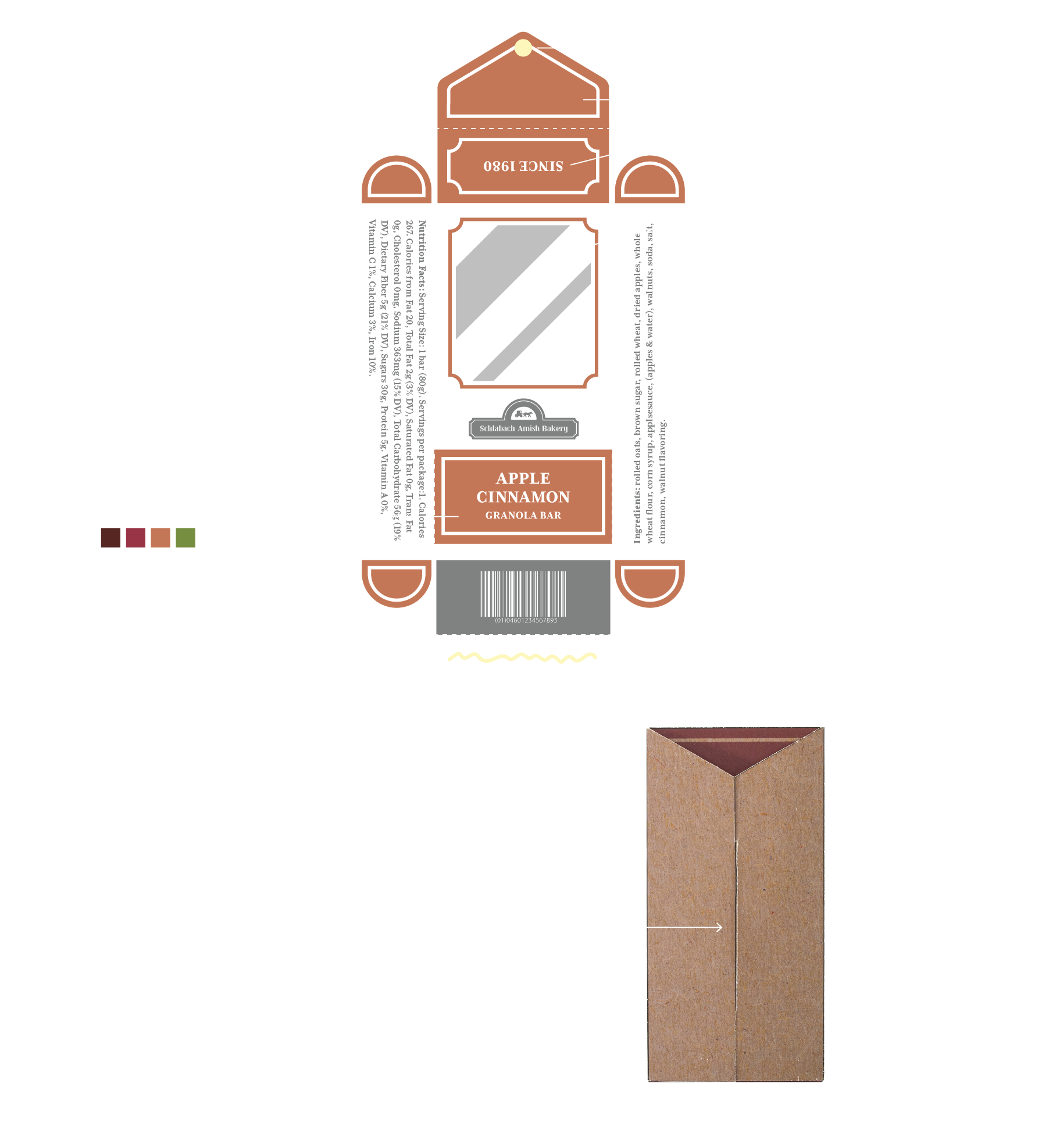
Dieline
The dieline was designed as one piece of material that could be assembled without using glue or tape to maximize sustainability. This was achieved through flaps that interlock and create tension.
Because the granola bars are hand-pressed and therefore inconsistent in size, my biggest challenge was finding the most effective package to prevent rattling or breakage during transportation and handling. My process was by thinking through the folds, laying out the shapes in Illustrator, printing that on copy paper, testing the folds, then refining from there. It was a lot of trial and error to arrive at the final design.
If I were to do this again, I would buy a similarly shaped boxed product and reverse engineer it to get me to the final design faster.
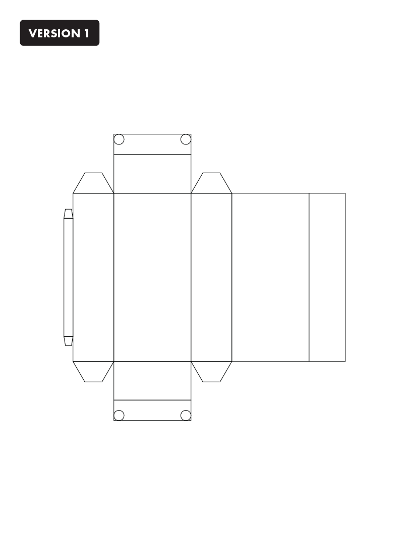
Version 1
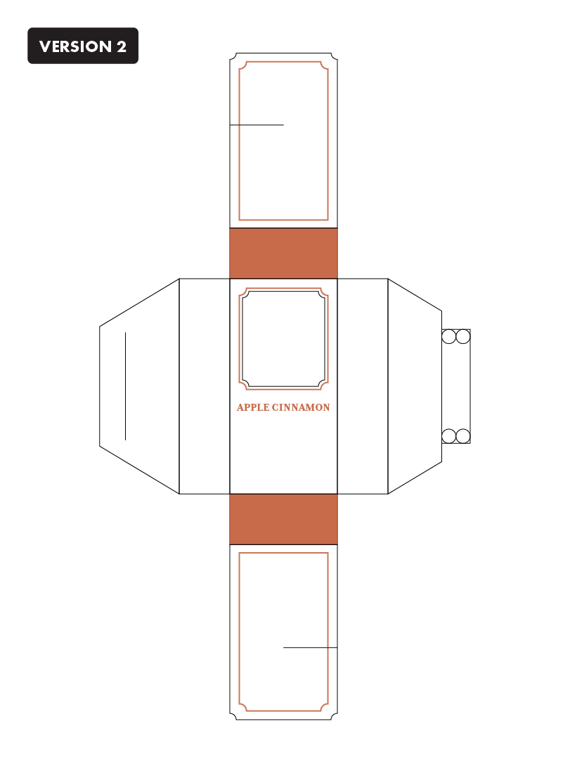
Version 2
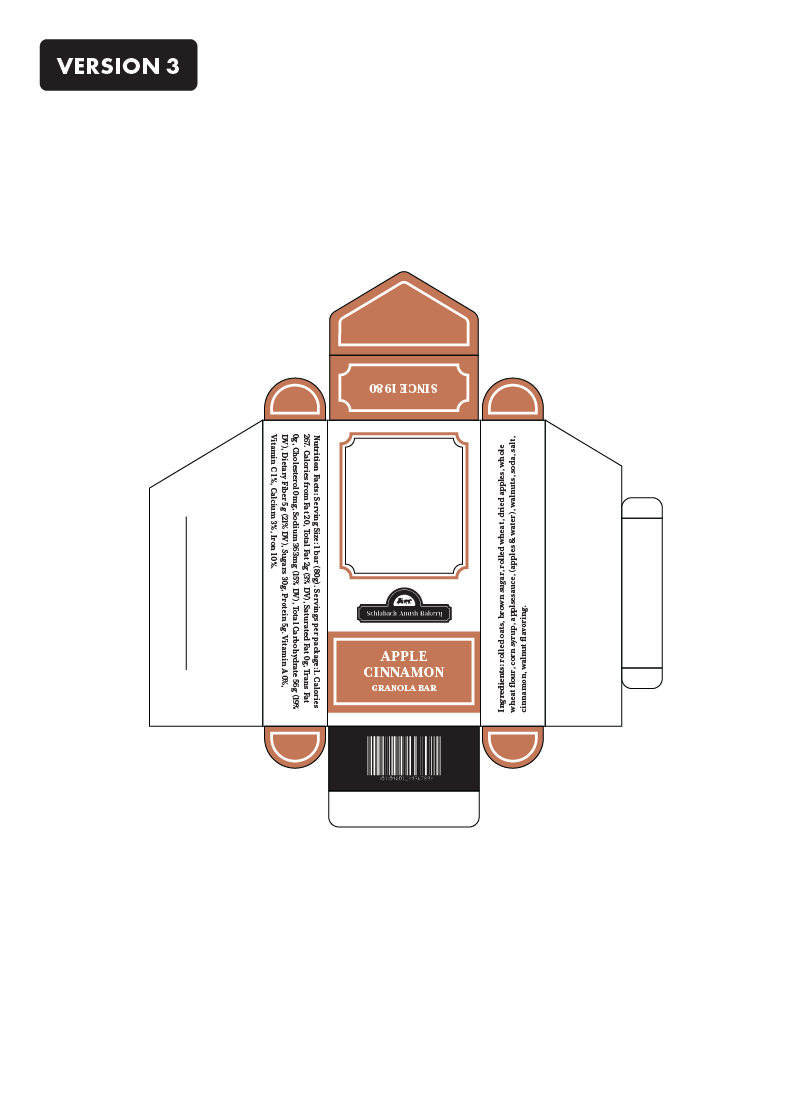
Version 3
Final